4. How did you use new media technologies in the contraction and research, planning and evaluation stages?
1. I used an image of The Queen of Hearts is a character from the book Alice's Adventures in Wonderland by the write Lewis Carroll. She is a foul-tempered monarch, that Carroll himself pictured as "a blind fury", and who is quick to decree death sentences at the slightest offense. Her most famous line, one which she repeats often, is "Off with their heads!" I have chosen to feature her character in my video to add to the quirkiness that is a common convention and code in the Alternative Genre. I proceeded to ask questions about this character to see if my idea was accepted. However, as my video developed I decided not to include this character in my storyline despite making a costume!
Queen of hearts outfit by s0013117 on GoAnimate
Animated Presentations - Powered by GoAnimate.
2. I included a video in my questionnaire
This song tells a story of a girl who originally gets her heartbroken, then becomes stronger and dominant in the marines, and is able to dismiss her ex boyfriend's pleas... I wanted to know if the the theme of women being empowered was attractive and exciting to my audience.
5. Finally after being satisfied with interviewing my audience about their expectations I looked at the physical side of making a music video.
I chose the music video Hot n Cold by Katy Perry since this video had a complex storyline, lots of different scenes and editing techniques I thought about emulating. Consequently I asked my audience to rate the mise-en-scene, editing, lighting, performance of the artist, and cinematography.
I recorded and uploaded my audiences' responses.
I recoded this video on my Macbook Pro using iMovie, I encountered a problem here as I could not upload it to youtube. However after searching the internet for advice I realised I had to convert the movie to Quicktime.mov and then it successfully uploaded.
I encountered a problem here as somebody deleted all my footage from when I recorded and interviews my friend Amy before it had finished uploading.
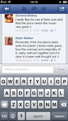
Furthermore, before I could start creating my music video and ancillary texts I had to define my demographic audience, therefore I created polls on my blog.I used social media to allow them to be accurate and I sent out this message to my friends to gain audience feedback on my polls which are on my blog (I used Blogger throughout the process of my coursework to record everything I have done from planning to finished products):
Process:
First of all I drew storyboards, although my drawings were extremely crude the basic idea was hopefully portrayed. For some of my drawings I asked my friends to help create what I was sorely attempting to draw on the paper. After this I labelled and defined most shots from my storyboards which can be clearly seen in the hyperlinked post. In total I had 35 sheets of storyboards!
Next I after using an espon scanner I saved all my storyboards as images and used the cut and snip tool on a windows seven computer to separate the images
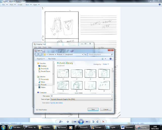
Then I tried to edit the speed and timing of each picture to what I would do in the actual filming to have a basic idea of what I wanted to achieve
Looking back from my animatic to my final video there are a lot of things that are similar but some shots are drastically different. However my ideas have developed over time e.g. the bloody scene was missed out, the journal scene is more exciting and the ending is more effective. I am very happy with the changes I have made from my original idea.
Obviously one of the most important factors of my music video is the actor, after a lot of deliberation I chose my friend Megan Berridge, aged 17 to be the protagonist and main actress of my music video.
(picture above in the audience profile)
Acting (protagonist) by s0013117 on GoAnimate
Video Maker - Powered by GoAnimate.
After further study concerning the alternative genre I realised that costume was a very important factor to reflect the codes of connotations the the alternative quirky nature within my artist. As wellas her music, Marina and the Diamonds is also notable for her unique attire and appearance. When asked in an interview to describe her fashion style in three words she replied "vintage, cheerleader, cartoon" here is an animated example: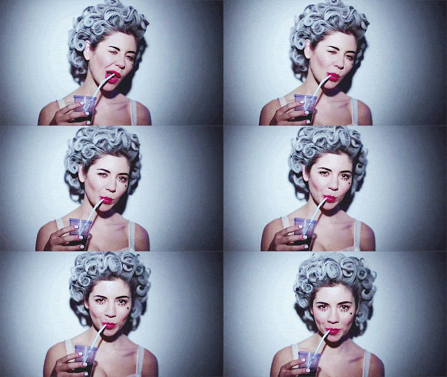
In order to gain more knowledge in this area I followed her fashion and style choices as she participated in Vouge's 'Today I'm wearing section' Where she posted what she wearing every day for one month.
http://www.vogue.co.uk/photo-blogs/marina-diamandis/marina-diamandis-day-1
With this information I reviewed and analysed the connotations of many outfits for each scene so that the costume represented each scene effectively. In total I had 7 different scenes in which my protagonist featured.
1. Wedding Scene
2. Journal Scene
3.Bedroom Scene
4. Drunk Wedding Scene
For this scene I used the same costume for continuity reasons.
I did not want them to look like they had been shot on different days. In this process I had to match the lighting and weather conditions of the church scene and used a weather app on my iPod.
5. Date Scene
6. Green Room Scene
My ideas changed a lot for the green room scene throughout developing the video. Originally I planned to have a Queen of Hearts figure and created an outfit since after interviewing my friends if they though the queen of hearts represented both power and the alternative genre the results showed she was an appropriate figure.
However, since I also am a classics student I really wanted to pursue a personal interest in my music video: Helen of Troy. It came to my attention that she is the first homewrecker in antiquity and I thought it would exciting to pull out this ancient greek style in my music video. However, I realised that my music video had to be suited for the audience not just what I am interested in, therefore I created an online survey using survey monkey.com Click here to take survey to obtain accurate results.
The results showed that the majority preferred the Helen of Troy idea after all. I started to read the book for research purposes 'Helen of Troy' by Bettany Hughes published by Pimlico 2006 Pages: 496 (Focusing on the 'real' Helen - a flesh-and-blood aristocrat from the Greek Bronze Age - this title reconstructs the context of life for this elusive pre-historic princess. Through the eyes of a young Mycenaean woman, it examines the physical, historical and cultural traces that Helen has left on locations in Greece, North Africa and Asia Minor.) and found some interesting notes that reflected the attitude I wanted to emulate in my protagonist:
7. Chorus
To create a disco effect I used two similar black leotards and fishnet tights for my 2 dancers. I paired this up with a cropped sleeveless denim jacket. I then used a see through leotard and tights with a different pattern for my protagonist. I also added a spikey long sleeved denim jacket to make her look rebellious but also attractive and promiscuous. Here are some photos i put on a slide show on you tube:
Obviously the locations of each scene was an important factor for making my video look realistic:
Here I added ivy to metaphorically represent the uncontrollable wild nature of my artist
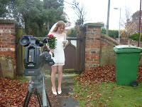
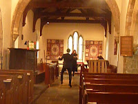
I bought flowers and brought make up to ensure that everything looked realistic
I also changed the misenscene of the bedroom scene which can be seen on this link.
I looked on many websites for props to be part of the mise-en-scene in my video as well. However most of the props I looked at buying were very expensive and not affordable, therefore I decided to visit my old secondary school, Longcroft. Luckily they agreed to let me use some of their dance/drama props in my music video and since it is a performing arts college there were many props and costumes I could have access to.
For the journal scene I had to create my own prop (the journal):
I posted on a social networking site if somebody could do lighting for my dance part of my music video and as I wanted a professional look, I got a reply from AFC Entertainment a local company who supply lighting and sound for discos etc...This was absolutely fantastic as I knew that AFC Entertainment are a great company that I can rely upon to do a fantastic job after attending rock challenge competitions, parties and theatre productions that have used their services before! I was very grateful and excited about this!
Here is their website : http://afcentertainment.webs.com
I used twitter to connect with him...
AFC Entertainment mainly specialise in mobile discos and effects lighting hire, however we also have experience in P.A. system hire and stage lighting systems suitable for presentations or events such as open mic nights and sporting competitions, from small scale rigs consisting of a few dimmers to a larger system including moving lights and strobe effects.
I arranged for my dance scene to be filmed via social media:
It took a lot of time to find a date suitable for Meg, Kat, Sam, Alex and the media technician Clayton to be available. Without them the dance, lights and props would not be done properly when filming.
It took a lot of hard effort to get the dance to look effective...
Throughout the whole process I updated my blog with production plans on each part of the filming process. Over time it is evident that my production plans became more accurate and organised.
I also created lists to keep up-to-date with work on my blog, here is an example. Moreover I kept an edit log to track my progress and note achievements and discoveries made on the edit suite.
Furthermore I added some specific posts on my blog about other unfortunate mistakes that occurred at various points throughout the process.
1. blank tape
2. accidentally saving over work
3. boys on scooters
3. no tape in camera plus unexpected dancers
4. tampering
Also, I analysed some of my shots to spot mistakes throughout the process. Upon realising there were errors I had to reshoot some scenes e.g. the chorus was filmed on two separate occasions. The ring was out of focus in my original draft therefore I had to film it again with someone else putting the ring on Meg's finger in my bedroom. I reshot a close up of Meg's mouth since she had her hair cut and the lipsyncing was out on all previous shots. There are many more alternations that can be seen visually here:
This was put together when I had first shot my wedding scene. I noticed that some shots were not precise looking at the emotion reactions. Some shots were too elongated and tedious, others were not necessary.
My teachers noted that the wedding ring was out of focus therefore I needed to reshoot it. Also the first few shots with the effect look like a mistake (which it was) so I had to think of a better idea to do the lip syncing.
Looking at this I put a too dark effect on my video and this was picked up on by my teachers.
Here I tested out some green room shots to see how much contrasting magenta lighting I needed.
Here I added the date scene but I realised I added far too much shots and it looked very messy so I made it my aim to change this.
This was my first attempt at shooting the dance. My teachers noted that it was quite flat and not dynamic to reflect the dance itself. I was not happy with my chorus or performance of my artist or dancers as it was too rushed and did not look professional. The chaos really came across on camera.
This is my final A2 Video, further below I have provided an in depth analysis and my thoughts on this. (later in my evaluation)
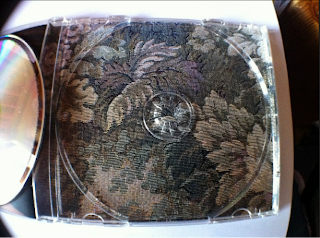 The overall look of the digipak is has a vintage feel with the faded pattern, there is an old fashioned essence of the digipak, that could show heritage to tie in with the name of the album name, "Family Jewels". the typography of this is soft and feminine, it is carefully manipulated to appear as if it is painted by hand onto the surface of the cover or signed as if an autograph which shows her star image. The extreme close up of her face helps the customer to identify it is hers from a distance. The photograph has several purposes and connotations, for example Marina’s eyes are making direct contact with the camera and are therefore seductively staring at the customer, the fact the Marina is looking down from the corner of her eyes gives her this sexual look as if she is inviting the customer in to her private life and essentially songs. The white shading of the text is chosen to bring out the dazzling whiteness of both Marina's teeth and eyes. The finish on the photograph is blatantly artificial and fake since she is clearly and not denying the fact that the photo has been manipulated. This could represent some of the feelings she portrays in her album about the position of women in society and could mock other stars, it mocks the fact the women should be perfect by exposing that she has been manipulated in the photo. The fact that Marina is lying down and is seen to be nude and uncovered, represents Marna’s alternative rebellion to stereotypes. The way Marina’s hair is not neatly pinned but loose and wild could also represent this sexuality.
The back of the disk follows the dame house style and font. Also the image is still a close up and the position and attitude is very provocative. The motif of nudity and rebellion is continued and the finish and effects that were applied to the front have obviously been followed through onto the back. However it is important to note the shadowing on her back and the shape of it and how the light colours sharply contrast with the darkness of her hair, a kind of macabre and machean imagery. They are clear to be seen!The way her hair falls as she leans back seductively shows Marina mocking women being shown as a sex symbol. Again, the whiteness of the text is emulated in the whiteness of Marina’s teeth and eyes and links Marina’s songs to her mouth and imagination. The way the songs have been placed on the back breaks conventions of an ordinary list as the list sweeps round to cover the image of her, indicating that the songs are her own.
I looked at a template to see what spaces I had to work with.Next I took some photos whilst filming the chorus to use, however I also exported screen-shot-photos from the edit suite. I did this by extracting them as TIFF files, I selected the clip I wanted to extract and exported it into my folder.
E.g.Note idea number six is taken from Shapespeare's MacBeth
Look like the innocent flower, but be the serpent under't (1.5.74-5)
Some editors believe these lines derive from Virgil's Eclogues 3.93,
Animation Software - Powered by GoAnimate.
RESULTS:
Therefore my chosen artist name is: Orea Eleni (beautiful Helen in Latin)
My album name is between: serpent flowers, temptation, and wine-dark sea.
I have eliminated wine-dark sea since it does not have much relevance to my narrative Also I have eliminated Serpent Flowers for the album name since Temptation is much more impacting and provides a more central and less obscure relevance to my music video themes.
FINAL CHOICES
ARTIST NAME: Orea Eleni
beautiful Helen in Latin. The latin twist creates a eerie feel to this mystical language and reminds the audience of the first ever homewrecker Helen Of Troy.
ALBUM NAME: TEMPTATION
I used this single minor sentence as a title to be bold and impacting, this also relates to Helen of Troy
RECORD LABEL: SERPENT FLOWERS RECORDS
This theme is further explored by the disguise my actor hold when seducing men and relates to the note I put with my choice above.
I also looked online for font choices to create a house style on my album.
I created both ancillary texts using Adobe Photoshop; I found this process relatively easy, as I am familiar with Adobe Photoshop due to work I had to complete for media last year www.oliviabucknall.blogspot.com . However, the program still presented me with a few challenges since it had been a while since I last used it.
I then began drafting and manipulating my images on photoshop, beside each draft I have written up my thoughts on what I could improve:
DRAFT 1
DRAFT 2
Throughout this I showed my editing process to get to my third draft and final product after desaturating Meg's face.
I did the same process when researching my magazine promo advert.I came accross a number of codes and conventions used:
The text contrasts and clearly stands out against the rest of the advert
Next I created mock ups on Microsoft Publisher to decide where each element of the advert would sit on the page. I tried a variety of styles and broke conventions by putting the reviews at the top of the promo rather than the masthead to experiment.
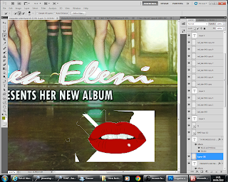
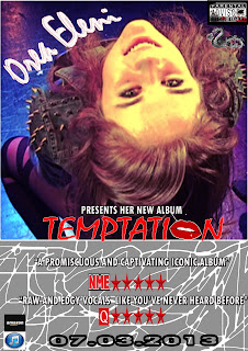
I realised with my first draft the iTunes logo did not stand out so I moved it above the other layers. I also noted that the name Orea Eleni would be better popping out the page to mimic the artist.
I also allowed a faint white line to separate the image from the box containing information since this is a convention I saw in Jessie J's album promotion (explained further below)
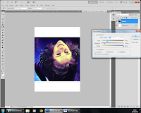
I manipulated the picture on many occasions to try to get rid of the saturated tone of yellow which was caused by a bright yellow light being shone on the artist during the dance scene. Originally I liked the idea but I was soon regretting it after comments from peers that she looked like 'a simpson' or 'a lemon head', that wasn't quite the image I was going for!
I loved this image manipulated with the colour balance to give it so much depth. However it did not help promote my digipak or fit in with the house style of my video. I needed these three products to complement each other so I chose to abandon it.
I also applied this to the spike on the jacket that was part of the costume to give her raw and edgy persona for my character to emphasise the sharpness in the jacket. This ideology also linked with the quotation I invented to go alongside my artist in the reviews "raw and edgy talent..."
To attempt to get rid of the 'simpson syndrome' as named by my classmates I tried to edit the curves and saturation to create a more human skin tone. However I did want a brightness to her skin which was quite difficult to define with my teasing friends.
The transition from 'simpson' to normal skintone can be seen through these images:
1. In what ways does your media product use, develop or challenge forms and conventions of real media product
Although I have identified the codes and conventions of alternative music videos, magazine promos and digipaks I have reposted this information here and slightly reworded it as it is relevant to this question too.
MUSIC VIDEO
Initially I researched and analysed music videos on youtube in this genre and realised that the codes and conventions of an alternative music video can vary. I analysed 3 videos in detail, 2 narrative and one performance to see different ideas that I could apply. The first video I analysed was Shampain by Marina and the Diamonds. I wanted to see what was typical of my artist in her music videos, and I was happy to see that this video included both dance and narrative. Next I analysed Twin Atlanitc's music video a different alternative video, this time performance based to gain an insight. After I analysed another narrative music video called It's My Life to see how the narrative was portrayed in a short time.
I concluded that mainly, the audience would expect to see the artist in the video acting, dancing or performing as themselves or as another character and adopting a different persona. Costume is an important aspect of an alternative video too as it should be quirky and individual, not relating to the latest fashion like mainstream genres. The camera shots used in an alternative video don't seem to have any conventions as each video is quirky and individual like the artist and likes to not follow conventions The lighting in a alternative music video is adapted to the mood and atmosphere of the video, a kind of visual pathetic fallacy e.g. when the artist is sad, the lighting should be dull to reflect the mood and atmosphere. When the artist is happy and confident the lighting should reflect this too.
DIGIPAK
When considering my ancillary texts I again had to carry out studies and analysis to make sure I was aware of what I was recreating. I started by researching the digipak to gain understanding of what elements it should contain and which codes and conventions I wanted to follow/challenge. I found out some useful information:
Every side of the digipak is similar to the other and follows the same house style, and represents the artist in the same way - therefore I will not be using the wedding scenes, running away scenes etc in my digipak since this is not continuous like the chorus
The typography is visible and clear to read
The front of the digipak features the artist's name and album name, alongside an image
The back cover shows a list of songs that are included on the CD - sometimes with abar-code
The CD is also decorated to fit with the colourscheme
MAGAZINE PROMO
I did the same process when researching my magazine promo advert.I came accross a number of codes and conventions used:
The text contrasts and clearly stands out against the rest of the advert
CLOSE TEXTUAL ANALYSIS OF MY PRODUCTS
Obviously whilst I was filming there were many mistakes made I have put together a video to show these errors and some funny moments throughout the process. It was a frustrating yet enjoyable task
I analysed all of my shots (137) here to show my thought process and to explain why I inclueded certain aspects e.g. mis-en-scene, framing shots etc... Throught I have included my opinions on what I would have liked to of done differently if I had the time and if my actors had the time:
I chose this next shot as it differed from my other shots making my video exciting and more professional. Furthermore, my audience's attetion had to be focused on my artists lips so I made sure the lip syncing was as perfect as I could get it. I thought my idea about the lips worked really well to connote sexuality of women being seductive, she also seduces the audiecne here. Moreover, the lips is a direct link to my ancillary texts "TEMPTATION" with the lips replacing the O.
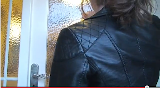
Half way through the last chorus I cut back to the date scene and shot an over the shoulder shot of Meg at the front door of "Eric's house"so I could allow continuity with him opening the door a traditional media technique.
I had to analyse and research other examples of record labels to grasp an idea of what a typical one would look like:
3. What have you learned from your audience feedback?
I also filmed an audience feedback number 7 video however the media technician deleted it from the memory card before it had uploaded again.
I posted my video on you tube
Animation Software - Powered by GoAnimate.
An in depth analysis of my magazine promo, showing the effectiveness of the combination of products between the cross synergy elements such as my images, house style and thought process to promote my products as trio. Also shows impact on audience:
Pictures from the throughout the vide and mainly chorus and analysis to show the cross synergy elements that connect my other products to the video
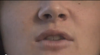
I chose this next shot as it differed from my other shots making my video exciting and more professional. Furthermore, my audience's attetion had to be focused on my artists lips so I made sure the lip syncing was as perfect as I could get it. I thought my idea about the lips worked really well to connote sexuality of women being seductive, she also seduces the audiecne here. Moreover, the lips is a direct link to my ancillary texts "TEMPTATION" with the lips replacing the O.
When deciding which song
to use in my music video, I knew I wanted something edgy and exciting that I
could create a good narrative story to. I did have an initial inspiration from reading the Roman epic of Virgil's Aeneid. ("The Aeneid is a Latin epic poem, written by Virgil between 29 and 19 BC, that tells the legendary story of Aeneas, a Trojan who travelled to Italy, where he became the ancestor of the Romans. It is composed of 9,896 lines in dactylic hexameter." Wikipedia) I was really touched by BOOK 4 DIDO. Where Dido, once a strong and courageous woman is corrupted by Aeneas' love which the emotional turmoil and heartbreak of him leaving her leads to her suicide. As a modern reader it was easy for me to see the suffering of the innocent and the decieved as wrong, and assume that love overpowered the duty Aeneas had to fufill. In a Roman context obviously duty would come first. It gave me an idea to empower women in my music video. Therefore, whilst listening to my iPod I visualised stories that accompany the song which empower women, I also wanted dance routines for certain parts of the song. My chosen song is called 'Homewrecker' from the album Electraheart by Marina and The
Diamonds, an artist belonging to the alternative genre. Which really empowers women as dominant over men "I break hearts just for fun". Currently the song does not have an official music video, I personally think this is better as it allowed me to be more creative and original with my ideas. To come up with the narrative of my story I had to analyse the song's lyrics for meaning.
Here is the basic narrative of my music video: (which has been edited over time as you can see in the previous hyperlink)
Here is the basic narrative of my music video: (which has been edited over time as you can see in the previous hyperlink)
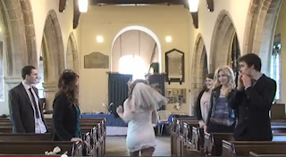
- The opening of the song is very hymn-like therefore I am going to start my video with a wedding set up where eventually my protagonist runs out of the church leaving the groom and vicar bewildered. I am hoping to make this scene comical to entertain my audience,
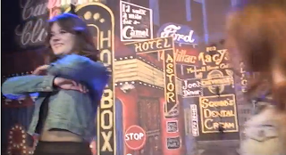
- Next it is the chorus where I will have 2 females and my main protagonist dancing in a night club scene which should be fun and exciting
- After this I will define my storyline with my protagonist flicking through an obsessive journal full of pictures of the men's hearts she has broken, and I will focus on her next 2 targets. This will show her obsessed mind. The main focus will be at the end of the journal where it says "secret date at ... house" to show the audience where the story is heading. I took this idea from Mean Girls and made an intertextual reference to the burn book.
- Again the chorus will be repeated - this is so the video is not too random and has the theme of my protagonist being dominant and breaking hearts and has some continuity to show it is an ongoing cycle.
- In the next part of the song I thought victim number two could come in, since the sound is very deep and mysterious I thought I could have my protagonist leaving someone in the night who had been in a supposedly long relationship.
- At certain fitting lines I will have cut backs to the wedding scene (this is further developed on in my lyrics analysis post) whilst looking into a mirror like a flashback.
- After this part of the song, the beat changes and the tone is of something omnipotent and almost has a religious feel. I had to think for a long time about what to do in this section, and eventually decided upon using the green room to portray another exciting disco world in which she belongs. Also in this part I will cut back to revisit the boys who have had their hearts broken, an idea taken from the song It's My Life and see the emotional turmoil and consequences of this action.
- Again the chorus will be repeated - this is so the video is not too random and has the theme of my protagonist being dominant and breaking hearts and has some continuity to show it is an ongoing cycle.
- However at the very end I will have my protagonist walk into the last victims house where he naively has created a romantic setting to try to seduce her, ironically she has the upper hand in seducing him and ultimate control, which carries through my initial theme of empowered women. towards the end she will literally nod and wink at the camera to confirm the audience's thoughts that he is the next target and blow out a candle which will then fade to darkness as a sort of cliff hanger and enigma...
Initially I researched and analysed
music videos on youtube in this genre and realised that the codes and conventions
of an alternative music video can vary. I analysed 3 videos in detail, 2 narrative and one performance to see different ideas that I could apply. The first video I analysed was Shampain by Marina and the Diamonds. I wanted to see what was typical of my artist in her music videos, and I was happy to see that this video included both dance and narrative. Next I analysed Twin Atlanitc's music video a different alternative video, this time performance based to gain an insight. After I analysed another narrative music video called It's My Life to see how the narrative was portrayed in a short time.
I concluded that mainly, the audience would expect to see the artist in the video acting, dancing or performing as themselves or as another character and adopting a different persona. Costume is an important aspect of an alternative video too as it should be quirky and individual, not relating to the latest fashion like mainstream genres. The camera shots used in an alternative video don't seem to have any conventions as each video is quirky and individual like the artist and likes to not follow conventions The lighting in a alternative music video is adapted to the mood and atmosphere of the video, a kind of visual pathetic fallacy e.g. when the artist is sad, the lighting should be dull to reflect the mood and atmosphere. When the artist is happy and confident the lighting should reflect this too. However I realised that to even attempt to use, develop and challenge media products within my music video and ancillary texts I had to research further: the psychographics. To successfully do this I picked out a range of 5 influential texts and conducted interviews upon them to see if my ideas and styles were accepted within my demographic audience.
I concluded that mainly, the audience would expect to see the artist in the video acting, dancing or performing as themselves or as another character and adopting a different persona. Costume is an important aspect of an alternative video too as it should be quirky and individual, not relating to the latest fashion like mainstream genres. The camera shots used in an alternative video don't seem to have any conventions as each video is quirky and individual like the artist and likes to not follow conventions The lighting in a alternative music video is adapted to the mood and atmosphere of the video, a kind of visual pathetic fallacy e.g. when the artist is sad, the lighting should be dull to reflect the mood and atmosphere. When the artist is happy and confident the lighting should reflect this too. However I realised that to even attempt to use, develop and challenge media products within my music video and ancillary texts I had to research further: the psychographics. To successfully do this I picked out a range of 5 influential texts and conducted interviews upon them to see if my ideas and styles were accepted within my demographic audience.
1. I used an image of The Queen of Hearts is a character from the book Alice's Adventures in Wonderland by the write Lewis Carroll. She is a foul-tempered monarch, that Carroll himself pictured as "a blind fury", and who is quick to decree death sentences at the slightest offense. Her most famous line, one which she repeats often, is "Off with their heads!" I have chosen to feature her character in my video to add to the quirkiness that is a common convention and code in the Alternative Genre. I proceeded to ask questions about this character to see if my idea was accepted. However, as my video developed I decided not to include this character in my storyline despite making a costume!
Queen of hearts outfit by s0013117 on GoAnimate
Animated Presentations - Powered by GoAnimate.
2. I included a video in my questionnaire
I included a controversial headline in my questionnaire to establish the theme of empowered women that would be prominent in my video. This headline particularly interested me as and the style would be emulated my protagonist will be a controversial figure and heartbreaker. I thought it was very strong and powerful and this reflects my main character. I asked audience questions such as
- What do you think of women when you see this headline?
- Would you agree that in the past women were seen as the victim of heartbreak, but now, in modern times the table have turned?
- Would you like to see this theme of a dominant woman in a modern music video?
4. When creating the questionnaire I realised it was important that I established what my audience thought about heartbreakers and how they portrayed them, therefore I found a video that established these conventions in a simple song. 'How to be a heartbreaker'... From this I asked fitting questions such as to obtain accurate results that I could emulate in my own portrayal of my protagonist.
- Would you agree that the 'rules' pointed out in this video fit the conventional heartbreaker?.
- Can you suggest any other aspects of being a heartbreaker?
5. Finally after being satisfied with interviewing my audience about their expectations I looked at the physical side of making a music video.
I chose the music video Hot n Cold by Katy Perry since this video had a complex storyline, lots of different scenes and editing techniques I thought about emulating. Consequently I asked my audience to rate the mise-en-scene, editing, lighting, performance of the artist, and cinematography.
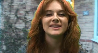
I recorded and uploaded my audiences' responses.
I recoded this video on my Macbook Pro using iMovie, I encountered a problem here as I could not upload it to youtube. However after searching the internet for advice I realised I had to convert the movie to Quicktime.mov and then it successfully uploaded.
I encountered a problem here as somebody deleted all my footage from when I recorded and interviews my friend Amy before it had finished uploading.
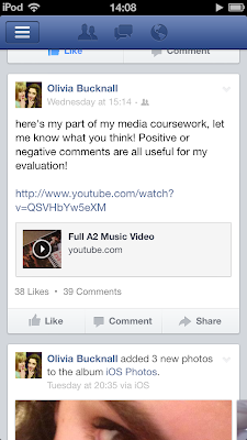
Furthermore, before I could start creating my music video and ancillary texts I had to define my demographic audience, therefore I created polls on my blog.I used social media to allow them to be accurate and I sent out this message to my friends to gain audience feedback on my polls which are on my blog (I used Blogger throughout the process of my coursework to record everything I have done from planning to finished products):
I developed this information into a reader profile on microsoft publisher:
From these results I realised that a narrative music video was more popular than other genres. Also the themes I was eager to explore were also mutually wished to be seen in my video... My audience's age range mainly consisted of students who were seeking individualism and new experiences. It also came to my attention how beneficial it was to put my video on YouTube since 95 percent of my audience access the internet everyday through proliferated devices.
After this I used Windows Movie Maker for the first time to create an animatic:
Process:
First of all I drew storyboards, although my drawings were extremely crude the basic idea was hopefully portrayed. For some of my drawings I asked my friends to help create what I was sorely attempting to draw on the paper. After this I labelled and defined most shots from my storyboards which can be clearly seen in the hyperlinked post. In total I had 35 sheets of storyboards!
Next I after using an espon scanner I saved all my storyboards as images and used the cut and snip tool on a windows seven computer to separate the images
After I saved each picture individually on my memory stick as the allotted space I had on the school network quickly became full. Next I clicked on add videos and photos to import the pictures

Then I tried to edit the speed and timing of each picture to what I would do in the actual filming to have a basic idea of what I wanted to achieve
Looking back from my animatic to my final video there are a lot of things that are similar but some shots are drastically different. However my ideas have developed over time e.g. the bloody scene was missed out, the journal scene is more exciting and the ending is more effective. I am very happy with the changes I have made from my original idea.
Obviously one of the most important factors of my music video is the actor, after a lot of deliberation I chose my friend Megan Berridge, aged 17 to be the protagonist and main actress of my music video.
(picture above in the audience profile)
Acting (protagonist) by s0013117 on GoAnimate
Video Maker - Powered by GoAnimate.
I chose Megan as we not only go to the same
college but live very close by to each other so this is really beneficial for
meeting up and discussing ideas, filming etc. Megan is a great actress and has attended many drama clubs in the past. I also think that her appearance really suits the look I want in my video; she is naturally
beautiful and could be a serious heartbreaker! She also is very individual in
the way she dresses and this is another reason why I think she would be perfect
in my music video and the rest of my design brief (she fits with the
alternative genre).
For my actor to successfully act like a homewrecker I decided to define the word to get it exactly right and I used dictionary.com on the internet
For my actor to successfully act like a homewrecker I decided to define the word to get it exactly right and I used dictionary.com on the internet
home·wreck·er/ˈhōmˌrekər/
| Noun: |
|
After further study concerning the alternative genre I realised that costume was a very important factor to reflect the codes of connotations the the alternative quirky nature within my artist. As wellas her music, Marina and the Diamonds is also notable for her unique attire and appearance. When asked in an interview to describe her fashion style in three words she replied "vintage, cheerleader, cartoon" here is an animated example:

In order to gain more knowledge in this area I followed her fashion and style choices as she participated in Vouge's 'Today I'm wearing section' Where she posted what she wearing every day for one month.
http://www.vogue.co.uk/photo-blogs/marina-diamandis/marina-diamandis-day-1
With this information I reviewed and analysed the connotations of many outfits for each scene so that the costume represented each scene effectively. In total I had 7 different scenes in which my protagonist featured.
1. Wedding Scene
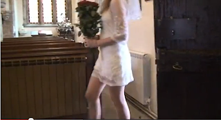
This dress does could look like a wedding dress when put with a veil, I particularly like this dress as it has the lace the connotes innocence but the skulls which could foreshadow the emotional turmoil of the groom. The skulls also put an ironic twist on the lyrics "I'm after a brand new start" since this connotes she is wanting a brand new start in a different relationship and the death of this current relationship in the scene.
As I was planning out my story board I became concerned that my shots would be too fast being 0.02 seconds long each and I wondered if this would make the wedding scene look too rushed and unrealisticly edited to the song.
To solve this I looked up different music videos that had a wedding scene in to find out how long the shots were...
1.In this song the wedding scene has very short shots some lasting less than one second. The whole marriage scene looks realistic and lasts for 10 seconds in total 2.
To solve this I looked up different music videos that had a wedding scene in to find out how long the shots were...
1.In this song the wedding scene has very short shots some lasting less than one second. The whole marriage scene looks realistic and lasts for 10 seconds in total 2.
In this song again some of the shots are one second and do not look out of place. This has cleared up my dilemma by doing some extra research.
2. Journal Scene
This dress effectively portrays my protagonist's attitude of looking innocent whilst being a heartbreaker. I have this opinion as the flowers that could connote innocence stand out and take the focus off the skeleton figure that encloses them all - foreshadowing the extreme grief that the victims of my protagonist's love will suffer and endure. It is also quite casual and not too fancy therefore would not look out of place in a home environment.
3.Bedroom Scene
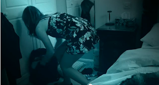
This nightie worked very well in my music video, the flowers against the black could show my character's personality (the flowers are hiding her cold heart/rebellion inside) The silk connotes sexuality and lust which is ideal as that is what this scene is about. When paired up with the leather jacket the combination does not silly or ridiculous like some of my other options since the length of the nightie is ideal.
I had to make sure that the nightie looked suitable with the jacket as the shots of my character walking out of the bedroom had to be very effective as they are important.
4. Drunk Wedding Scene
For this scene I used the same costume for continuity reasons.
For this scene I back combed Megs hair and went out in the late afternoon to show the passage of time.
I did not want them to look like they had been shot on different days. In this process I had to match the lighting and weather conditions of the church scene and used a weather app on my iPod.
5. Date Scene
In my opinion this dress will be great for the date scene that will be included in my video. The black connotes my protagonist's twisted obsession along with rebellion to the typical stereotype of females getting their hearts broken by men. The ball and chain gap in the middle of the dress could represent my character locking her true emotions away so she can be a heartbreaker. Also when moved about in the skirt is very dynamic and flows beautifully which will make my protagonist look very graceful and desirable during the date. It also fits with the "little black dress" stereotype that a woman wears when trying to seduce a man - which is effectively what my protagonist will be setting out to do in the narrative.
To take all the above photos I used this lumix 10 megapixel camera to all my photos and short videos for both my music video production and research and my ancillary texts.
To film my music video I used a HD 3 chip camcorder rather than a standard camera so I could get a sharper picture. The main reason for this was so I could accurately film the dance scene with the lighting effects which needed a higher definition camera. I also used a large tripod to film most of my scenes apart from the moving camera section in my dance parts. I personally actually found the tripod harder to operate than the camera in some ways by getting and framing the shots correctly and adjusting the tripod usually became a 2 man job. Luckily at the start of the process I found a part of the tripod that adjusted the whole middle section of the tripod which made it a lot easier to work with.
However I also found filming the moving camera parts quite difficult as my hands shook with the weight of the camera!
6. Green Room Scene
My ideas changed a lot for the green room scene throughout developing the video. Originally I planned to have a Queen of Hearts figure and created an outfit since after interviewing my friends if they though the queen of hearts represented both power and the alternative genre the results showed she was an appropriate figure.
However, since I also am a classics student I really wanted to pursue a personal interest in my music video: Helen of Troy. It came to my attention that she is the first homewrecker in antiquity and I thought it would exciting to pull out this ancient greek style in my music video. However, I realised that my music video had to be suited for the audience not just what I am interested in, therefore I created an online survey using survey monkey.com Click here to take survey to obtain accurate results.
The results showed that the majority preferred the Helen of Troy idea after all. I started to read the book for research purposes 'Helen of Troy' by Bettany Hughes published by Pimlico 2006 Pages: 496 (Focusing on the 'real' Helen - a flesh-and-blood aristocrat from the Greek Bronze Age - this title reconstructs the context of life for this elusive pre-historic princess. Through the eyes of a young Mycenaean woman, it examines the physical, historical and cultural traces that Helen has left on locations in Greece, North Africa and Asia Minor.) and found some interesting notes that reflected the attitude I wanted to emulate in my protagonist:
"Homer told the world what women like Helen could make men do
Helen is a captivating and troubling icon
A bedazzling, unfaithful queen, a duplictious homewrecker who causes decades of misery, she nonetheless remains unscathed: an inscrutable mix of self-will and suggestibility, intellect and instinct, frailty and power.
Helen is physically perfect and yet her perfection spawns disaster. She is clearly dangerous and still men cannot stop loving her.
The single most important female figure from this heroic age was the Spartan Queen "orea Eleni" 'beautiful Helen" Helen's story became abenchmark by which the world judged itself.
The first ever book that was published in the English Language was "The Recuyell of the Historyes of Troye" - from this moment on Helen did not only inhabit the imagination but also the mass media."
I also created prezis to show my costume and general research:
Research into the Trojan War on Prezi if it says this prezi does not exist please click on the link as it does! Due to costumes online being very expensive I asked if I could search Longcroft school's costume cupboard for ideas and I found ideal costumes for Meg in the Green room and dancers in my chorus:
This dress looks very sparkly and different to suit my protagonist's personality, the daring colour shows her confident personality and will convey this in my video." This dress is actually ideal for the dance scene to match the other dancers outfits who are going to be wearing outfits of the ancient greek connotations.Since my artist needs to look like Helen of Troy I had to do further research to see what her costumes looked like. I have realised that in Ancient Greece women were seen as more attractive if they had paler skin and this is why many statues were carved out in ivory etc. Helen was seen as not only white and pure but golden. She was said to have golden hair golden skin and be shimmering with al her jewels and dresses. This is what makes this dress ideal as it is golden and does shimmer like Helen of Troy would have done. Also I have found a golden hairband that my protagonist may wear like Helen does in the movie. Furthermore since the dress is quite low cut is is quite sensual which is what Helen of Troy also connoted.
Despite my extensive research I decided to abandon the Helen of Troy idea to be presented in my video and use the idea later in my ancillary texts since despite all my efforts it was not clear that my actress was Helen of Troy to those with little knowledge about it. Therefore I drastically changed my idea to a disco nightclub theme which could be seen as a hang out place of my protagonist.
I also did further research into deciding how to portray ancient greece in the green room and was inspired by this video:
Despite my extensive research I decided to abandon the Helen of Troy idea to be presented in my video and use the idea later in my ancillary texts since despite all my efforts it was not clear that my actress was Helen of Troy to those with little knowledge about it. Therefore I drastically changed my idea to a disco nightclub theme which could be seen as a hang out place of my protagonist.
Meg with bright magenta lights to allow editing as the magenta contrasts with the green allowing me to change the background
A softer fill light to allow Meg's skin to glow. Also lyrics printed for Meg on a stand in case she forgot them
Camera set up and ready on tripod.
Fan to cool Meg down after the intense bright lights, also to allow a bit of movement to the shot e.g. hair blowing a tiny bit.
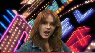
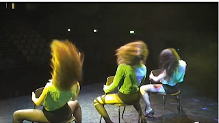
To create a disco effect I used two similar black leotards and fishnet tights for my 2 dancers. I paired this up with a cropped sleeveless denim jacket. I then used a see through leotard and tights with a different pattern for my protagonist. I also added a spikey long sleeved denim jacket to make her look rebellious but also attractive and promiscuous. Here are some photos i put on a slide show on you tube:
Obviously the locations of each scene was an important factor for making my video look realistic:
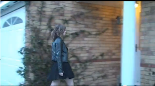
Here I added ivy to metaphorically represent the uncontrollable wild nature of my artist


I bought flowers and brought make up to ensure that everything looked realistic
I also changed the misenscene of the bedroom scene which can be seen on this link.
I looked on many websites for props to be part of the mise-en-scene in my video as well. However most of the props I looked at buying were very expensive and not affordable, therefore I decided to visit my old secondary school, Longcroft. Luckily they agreed to let me use some of their dance/drama props in my music video and since it is a performing arts college there were many props and costumes I could have access to.
For the journal scene I had to create my own prop (the journal):
I used the hearts pattern from my Mum's valentine's card.
I cut out some hearts from red paper
I found red and pink pens to connote danger, innocence but most of all love and the dangers of femininity...
I manipulated an image on iPhoto to create an effect that Jacko was in a previous relationship with Sally. i chose this image as it had a background of London so could look like a romantic outing
here is the final image after using the crop tool.
I added an effect of 'enchance' to this image to enhance it to make it clearer
I bought a sketch pad from THE WORKS for £2.99 to decorate into the journal
I printed out photos I had manipulated and taken on previous dates to include in the journal
When making the front cover I downloaded a font from www.dafont.com to find a newspaperesque/mystery/criminal feel to my journal. I decided the appropriate front was the sex pistols font as it had all the connotations e.g. rebellion that I wanted. I used the colour red to connote danger and passion and how the two when conflicted together can cause horrific results (this book) I added a black stroke outline to allow the font to be clearer.
How the book looked previously
I purposely used Sellotape to create a hand made effect. I stuck on a few hearts from my parents valentines cards in different sizes.
I cut out photos
Glued them in with PVA glue
Afterwards stuck on the three hearts I cut out with double sided sellotape
Example of what was written. I found images of Meg with boys or images that would look like meg from a distance to create the effect that it was all her doing. I added large numbers starting from 28 to show she had been in numerous relationships. I also added commentary to help my audience understand the plot of my music video and the narrative.
Example of what was written. I found images of Meg with boys or images that would look like meg from a distance to create the effect that it was all her doing. I added large numbers starting from 28 to show she had been in numerous relationships. I also added commentary to help my audience understand the plot of my music video and the narrative.
Example of what was written. I found images of Meg with boys or images that would look like meg from a distance to create the effect that it was all her doing. I added large numbers starting from 28 to show she had been in numerous relationships. I also added commentary to help my audience understand the plot of my music video and the narrative. On some pages I left it blank to do filming or write the lyrics of the song.
Filming. My desk area was too dark therefore I had to find a lamp that produced a soft light
I brought this light from the spare room as the other lights had a too harsh glow
For the flashback scene the only prop I used was an bottle of alcohol which was almost empty to connote that it has been consumed.
For the date scene I chopped up carrots and put them in a pan to show that Rob was making a meal for Meg. I lit a candle for a romantic touch and also added a bottle of wine and flowers to emulate this mood further.
I posted on a social networking site if somebody could do lighting for my dance part of my music video and as I wanted a professional look, I got a reply from AFC Entertainment a local company who supply lighting and sound for discos etc...This was absolutely fantastic as I knew that AFC Entertainment are a great company that I can rely upon to do a fantastic job after attending rock challenge competitions, parties and theatre productions that have used their services before! I was very grateful and excited about this!
I used twitter to connect with him...
AFC Entertainment mainly specialise in mobile discos and effects lighting hire, however we also have experience in P.A. system hire and stage lighting systems suitable for presentations or events such as open mic nights and sporting competitions, from small scale rigs consisting of a few dimmers to a larger system including moving lights and strobe effects.
I arranged for my dance scene to be filmed via social media:
It took a lot of time to find a date suitable for Meg, Kat, Sam, Alex and the media technician Clayton to be available. Without them the dance, lights and props would not be done properly when filming.
It took a lot of hard effort to get the dance to look effective...
I created these short videos with iMovie on my Macbook Pro, here is the process of uploading the footage and addding headers and transitions:
When shooting my chorus I was firmly set upon the idea of the night-club scene rather than incorporating the Helen of Troy idea.
Throughout the whole process I updated my blog with production plans on each part of the filming process. Over time it is evident that my production plans became more accurate and organised.
- Production Plan 1
- Production Plan 2
- Production Plan 3 - especially here
- Production Plan 4
- Production Plan 5
- Production Plan 6 - and here
- Production Plan 7
- Production Plan 8
I also created lists to keep up-to-date with work on my blog, here is an example. Moreover I kept an edit log to track my progress and note achievements and discoveries made on the edit suite.
Furthermore I added some specific posts on my blog about other unfortunate mistakes that occurred at various points throughout the process.
1. blank tape
2. accidentally saving over work
3. boys on scooters
3. no tape in camera plus unexpected dancers
4. tampering
Also, I analysed some of my shots to spot mistakes throughout the process. Upon realising there were errors I had to reshoot some scenes e.g. the chorus was filmed on two separate occasions. The ring was out of focus in my original draft therefore I had to film it again with someone else putting the ring on Meg's finger in my bedroom. I reshot a close up of Meg's mouth since she had her hair cut and the lipsyncing was out on all previous shots. There are many more alternations that can be seen visually here:
This was put together when I had first shot my wedding scene. I noticed that some shots were not precise looking at the emotion reactions. Some shots were too elongated and tedious, others were not necessary.
My teachers noted that the wedding ring was out of focus therefore I needed to reshoot it. Also the first few shots with the effect look like a mistake (which it was) so I had to think of a better idea to do the lip syncing.
Looking at this I put a too dark effect on my video and this was picked up on by my teachers.
Here I tested out some green room shots to see how much contrasting magenta lighting I needed.
Here I added the date scene but I realised I added far too much shots and it looked very messy so I made it my aim to change this.
This was my first attempt at shooting the dance. My teachers noted that it was quite flat and not dynamic to reflect the dance itself. I was not happy with my chorus or performance of my artist or dancers as it was too rushed and did not look professional. The chaos really came across on camera.
This is my final A2 Video, further below I have provided an in depth analysis and my thoughts on this. (later in my evaluation)
To create my music video I used the program Adobe Premiere 5 on an edit suite, this enabled me to closely edit my footage using tools such as transitions and special effects. The main problems I experienced were editing the footage in time with the music – lip synchronisation since I had to place special markers and closely listen to the sounds and movements of my actor's mouth. It was not easy and demanded a lot of attention and concentration to make sure it was accurate so this was a steep learning curve for me. I mainly used cut edits for the transitions between my shots to make them pop out however; I also used dissolve transitions between shots to make them vivid and exciting.
This is the edit suite I worked on
Throughout the process I looked at this screen to closely look at what I was doing with the video
Here I had a very precise timeline to closely edit each shot as well as I could.
I used different TRANSITION effects such as dip to white dissolve for the flash back to create a sense of somnambulistic innocence and convey a flash back to my audience. Through effect controls I blended the white in to cover certain timings of my the shots so that it was clear to my audience.
I also applied certain effects to my actual shots such as MATROX CHROMA KEY to create a night vision effect by placing a blue/green tinge on my shots and lowering the saturation. My audience found it hard to believe that I shot the film in day light with my house lights on since it looked like night.
What's more, I used the green room when editing my music video. I realised and learned that the green of the background contrasts with the magenta lights to cancel out the background and allow me to create an alternative reality
I picked out the colour and altered the similarity. I had to use soft lighting in the green room so that the shade of green did not alter too much
I used edge thinner and edge feather to get rid of the faintest green parts as I could. I was unhappy that I could not always get no green on the picture.
I used other transitions too such as cross dissolve and additive dissolve to make my video lively
Here are some picyures to show how segmented my shots were through editing and how many shots I actually had!
I also included some Narrative Theories in my music video:
Tim O'Sullivan argues all media texts tell a story
Media texts offer a way of telling stories about ourselves - stories of us as a culture
He also argues that narratives have a common structure such as an establishment of the theme, the development of the problem and finally an increase of tension.
This relates to my media video as it does tell a story and my story shows the empowerment of women in our era and culture...
My video begins with the establishment of the theme of heartbreak as my protagonist leaves the male heartbroken in the church, then the problem develops as she moves on to her next target and leaves Jacko in the middle of the night leading to an increase of tension.
TERMINOLOGY
- NARRATIVE: THE STRUCTURE OF A STORY
- DIEGESIS: THE FICTIONAL SPACE AND TIME IMPLIED BY THE NARRATIVE - THE WORLD IN WHICH THE STORY TAKES PLACE
Pam Cook 1985 argues standard narrative structure should have a linarity of cause and effect with overall enigma
A high degree of narrative closure
A fictional world that contains verisimiltude
This could also relate to my music video since it does have cause an effect e.g. the marriage falling apart and then Jamie's depression. There is an overall enigma as there is a myster of whether to homewrecker will be caught or get away with it.
My video also has a high degree of closure since it ends on a cliff hanger: who will she move on to next? Will she ever be caught? I think it does contain realistic features of space and time.
Kate Domaillie suggested that stories could be fitted into one of eight stereotypes
Candide - the indomitable hero who cannot be put down e.g. Rocky
Circe: the innocent and the victim, the spide and the fly
Orpheus: the loss of something personal
This related to my music video since the Candide could be my unscated homewrecker. The Circes could be the innocent men who get their hearts broken and Orpheus, loss of something personal is the loss of love.
When considering my ancillary texts I again had to carry out studies and analysis to make sure I was aware of what I was recreating. I started by researching the digipak to gain understanding of what elements it should contain and which codes and conventions I wanted to follow/challenge. I found out some useful information:
Every side of the digipak is similar to the other and follows the same house style, and represents the artist in the same way - therefore I will not be using the wedding scenes, running away scenes etc in my digipak since this is not continuous like the chorus
The typography is visible and clear to read
The front of the digipak features the artist's name and album name, alongside an image
The back cover shows a list of songs that are included on the CD - sometimes with abar-code
The CD is also decorated to fit with the colourscheme
Here is an example of my research and analysis:
Tim O'Sullivan argues all media texts tell a story
Media texts offer a way of telling stories about ourselves - stories of us as a culture
He also argues that narratives have a common structure such as an establishment of the theme, the development of the problem and finally an increase of tension.
This relates to my media video as it does tell a story and my story shows the empowerment of women in our era and culture...
My video begins with the establishment of the theme of heartbreak as my protagonist leaves the male heartbroken in the church, then the problem develops as she moves on to her next target and leaves Jacko in the middle of the night leading to an increase of tension.
TERMINOLOGY
- NARRATIVE: THE STRUCTURE OF A STORY
- DIEGESIS: THE FICTIONAL SPACE AND TIME IMPLIED BY THE NARRATIVE - THE WORLD IN WHICH THE STORY TAKES PLACE
Pam Cook 1985 argues standard narrative structure should have a linarity of cause and effect with overall enigma
A high degree of narrative closure
A fictional world that contains verisimiltude
This could also relate to my music video since it does have cause an effect e.g. the marriage falling apart and then Jamie's depression. There is an overall enigma as there is a myster of whether to homewrecker will be caught or get away with it.
My video also has a high degree of closure since it ends on a cliff hanger: who will she move on to next? Will she ever be caught? I think it does contain realistic features of space and time.
Kate Domaillie suggested that stories could be fitted into one of eight stereotypes
Candide - the indomitable hero who cannot be put down e.g. Rocky
Circe: the innocent and the victim, the spide and the fly
Orpheus: the loss of something personal
This related to my music video since the Candide could be my unscated homewrecker. The Circes could be the innocent men who get their hearts broken and Orpheus, loss of something personal is the loss of love.
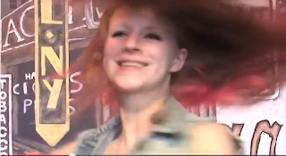
Furthermore I created a postmodern feel when my protagonist uses the self-reflective feature of breaking the fourth wall. I was inspired to do this when I watched another student video, this can be seen in my post my inspiration. By manipulating the camera she breaks conventions by bringing to the auidences' attention that the music video is a hyper reality. The shot is a medium close up to really see the artists emotion and dominance over the camera and media world.
 The overall look of the digipak is has a vintage feel with the faded pattern, there is an old fashioned essence of the digipak, that could show heritage to tie in with the name of the album name, "Family Jewels". the typography of this is soft and feminine, it is carefully manipulated to appear as if it is painted by hand onto the surface of the cover or signed as if an autograph which shows her star image. The extreme close up of her face helps the customer to identify it is hers from a distance. The photograph has several purposes and connotations, for example Marina’s eyes are making direct contact with the camera and are therefore seductively staring at the customer, the fact the Marina is looking down from the corner of her eyes gives her this sexual look as if she is inviting the customer in to her private life and essentially songs. The white shading of the text is chosen to bring out the dazzling whiteness of both Marina's teeth and eyes. The finish on the photograph is blatantly artificial and fake since she is clearly and not denying the fact that the photo has been manipulated. This could represent some of the feelings she portrays in her album about the position of women in society and could mock other stars, it mocks the fact the women should be perfect by exposing that she has been manipulated in the photo. The fact that Marina is lying down and is seen to be nude and uncovered, represents Marna’s alternative rebellion to stereotypes. The way Marina’s hair is not neatly pinned but loose and wild could also represent this sexuality.
The back of the disk follows the dame house style and font. Also the image is still a close up and the position and attitude is very provocative. The motif of nudity and rebellion is continued and the finish and effects that were applied to the front have obviously been followed through onto the back. However it is important to note the shadowing on her back and the shape of it and how the light colours sharply contrast with the darkness of her hair, a kind of macabre and machean imagery. They are clear to be seen!The way her hair falls as she leans back seductively shows Marina mocking women being shown as a sex symbol. Again, the whiteness of the text is emulated in the whiteness of Marina’s teeth and eyes and links Marina’s songs to her mouth and imagination. The way the songs have been placed on the back breaks conventions of an ordinary list as the list sweeps round to cover the image of her, indicating that the songs are her own.
I looked at a template to see what spaces I had to work with.Next I took some photos whilst filming the chorus to use, however I also exported screen-shot-photos from the edit suite. I did this by extracting them as TIFF files, I selected the clip I wanted to extract and exported it into my folder.
Once I had seen what I had to do and had some photos that I could use I started brainstorming for an artist name and album name. I tried to think of quirky ideas to suit the alternative genre like the other artists I had studied e.g. Marina and the Diamonds, Angels and Airwaves. Most of the names I thought of actually relate to my other A2 subjects English and Classical Civilisation, the other names are a product of wondering about unrequited love. Since I could not decide I asked people who were fitting with my target audience and produced questionnaires on microsoft excel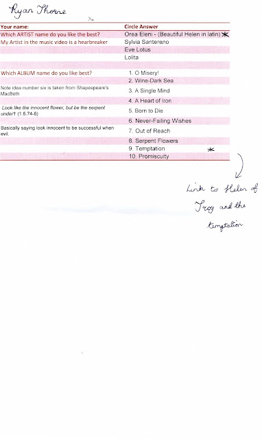
I included notes upon my thoughts on these choices to give my audience insight to my ideas
E.g.Note idea number six is taken from Shapespeare's MacBeth
Look like the innocent flower, but be the serpent under't (1.5.74-5)
Some editors believe these lines derive from Virgil's Eclogues 3.93,
You, picking flowers and strawberries that grow
So near the ground, fly hence, boys, get you gone!
After gathering the results I created a video to present my audience feedback in a creative way and further explained my choices
Audience feed back results by s0013117 on GoAnimateAnimation Software - Powered by GoAnimate.
RESULTS:
Therefore my chosen artist name is: Orea Eleni (beautiful Helen in Latin)
My album name is between: serpent flowers, temptation, and wine-dark sea.
I have eliminated wine-dark sea since it does not have much relevance to my narrative Also I have eliminated Serpent Flowers for the album name since Temptation is much more impacting and provides a more central and less obscure relevance to my music video themes.
FINAL CHOICES
ARTIST NAME: Orea Eleni
beautiful Helen in Latin. The latin twist creates a eerie feel to this mystical language and reminds the audience of the first ever homewrecker Helen Of Troy.
ALBUM NAME: TEMPTATION
I used this single minor sentence as a title to be bold and impacting, this also relates to Helen of Troy
RECORD LABEL: SERPENT FLOWERS RECORDS
This theme is further explored by the disguise my actor hold when seducing men and relates to the note I put with my choice above.
I also looked online for font choices to create a house style on my album.
I created both ancillary texts using Adobe Photoshop; I found this process relatively easy, as I am familiar with Adobe Photoshop due to work I had to complete for media last year www.oliviabucknall.blogspot.com . However, the program still presented me with a few challenges since it had been a while since I last used it.
I then began drafting and manipulating my images on photoshop, beside each draft I have written up my thoughts on what I could improve:
DRAFT 1
DRAFT 2
Throughout this I showed my editing process to get to my third draft and final product after desaturating Meg's face.
I added another picture to the digipak. I further enhanced Orea Eleni by increasing the stroke line on blending options. I added lips to add a cheeky feel to my album and replaced the O in temptation. I highlighted this with a white stroke outline to contrast.
I added a grey square and stretched it over the side bars to get rid of the font, then I used the eraser tool to create squiggly lines. I added record label information and made it slightly transparent so it did not dominate the area. I also added a barcode which I had previously forgotten about. I added the grey rectangles to the side of the cd which has Meg being picked up. I did this as the image was originally landscape therefore there was no way I could change the image without making Meg's legs look really wide. Overall I think this looks very effective.
MY FINAL DIGIPAK
- ARTIST/BAND NAME -close up for artist, longshot for band
- NAME OF ALBUM - prominent
- WEBSITE FOR FANS - minimalistic
- REVIEWS - sell line from a popular music magazine, usually rated out of 5 stars
- CD COVER ON ADVERT - to show continuity
- WHERE TO DOWNLOAD - e.g. iTunes logo
- DATE RELEASED - e.g. OUT NOW
The Artist/Band often look directly into the camera and are dominant throughout the splash of the advert.
The text is usually on the top and bottom of the advert however the image dominates
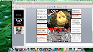
Next I created mock ups on Microsoft Publisher to decide where each element of the advert would sit on the page. I tried a variety of styles and broke conventions by putting the reviews at the top of the promo rather than the masthead to experiment.
On both my ancillary tests I realised it was essential to have a record label. Since I really wanted my products to be completely mine and not merely copy a record label off the internet I decided to create my own from home. Of course, I had to analyse and research other examples of record labels to grasp an idea of what a typical one would look like.
I decided upon the name Serpent Flower Record
Look like the innocent flower, but be the serpent under't (1.5.74-5)
Some editors believe these lines derive from Virgil's Eclogues 3.93,
You, picking flowers and strawberries that grow
So near the ground, fly hence, boys, get you gone!
There's a cold adder lurking in the grass.
For me, it is a memorable quotation from Shakespeare's Macbeth and portrays themes of evil lurking under the innocence. A strange and intriguing idea.
For it I have thought of an idea of entwining a serpent amongst some flowers in black and white with the name accross it.
I recorded notes and my thought process on the images I found.
Here is my drafting process once I had decided from the images:
This did not look as effective as I hope although I did like the compact shape.
This draft was difficult as I tried to make the flowers more prominent but I thought it looked childish and unporofessional which is completely the opposite of my aims.
Therefore, I decided to use a single flower. I change it to greyscale via the programme microsoft picture editor as this was very simple compared to the process on photo shop. I made this decision to allow my record label to fit with my image and follow a succint colour scheme. Once I had decided this is the style I liked I started considering text.
I wanted to use a white text to fit in with the house style however I noticed it was barely visable and looked silly above the image.
Upon seeing this I moved the text onto the snake, manupulated it with the stroke tool to allow it to be seen. I also used the arc tool to allow it to pop out the page and wrap around with the snake. I also used the eraser tool to reveal the once covered up snake teeth to allow my image to be effective.
After cropping the image down I was very happy with my finished product.
Next I analysed my image to see if it fitted with conventions:
I chose this record label out of my drafts since I think it was the most effective. I wrapped the text around the snake and embossed it with the stroke tool. I also used the same font as I used in the digipak for OREA ELENI to allow continuity.
The snake here, looks powerful and vicious which is what I wanted it to be like regarding the quote I found. Also, the flower looks magical and deceptive which again is fitting with the quote. The two images contrast but have been manipulated together to juxtapose and attract the eye.
I craftily used the eraser and rotation tools to rescale and move the flower appropriately . I also used the transfrom scale tool and arc tool to allow the font to become 3d and slightly pop out of the page. It is bold simple and to the point, also it is not colourful like other record labels I studied.
DRAFT 1
At first I experimented with colours to see which would stand out against my bright background. I also looked at a range of fonts
DRAFT 2
I realised the colour red suited the connotations I wanted achieve and experimented more with the splash
I realised the colour red suited the connotations I wanted achieve and experimented more with the splash
DRAFT 3
Next I added my own record label, made text larger and added a date. I still was far from happy with my product.
DRAFT 4
Next I changed the layout of my magazine advert completely as I did not like it. I preferred this draft above the others as it does not look cluttered. However the words such as 'temptation' do not jump of the pag. I also realised that the date was barely visible and my Temptation font could been seen to have connotations of dripping blood rather than lipstick.
In order to track my progress, I added an evaluative summary to each of these drafts such as:
- I changed the TEMPTED to red to fit with the house style and not be so obscure
- I also changed the font from BE TEMPTED 7TH MARCH to fit with the reviews so it was no so chaotic
- I also further embossed and gave a 3D effect to Orea Eleni to allow it to pop out at the audience literally.
REALISATIONS
- I have decided that the BE TEMPTED 7TH MARCH tagline is too long and not fitting.
- I may switch round the title to the bottom and reviews to the top
- Also the HMV logo is actually not relevant, since the media is becoming digitalised.
- I need to add a website
- I may consider taking more pictures to produce more drafts although I do like the look of this advert more than before.
- I do not know whether to experiment with a more close up picture of Meg or keep her with the dancers.
Since I redrafted that ancillary text so many times and was not happy with the results, no matter how I changed it. I decided to completely discard the idea and started again with a fresh design
PROCESS
I found clipart of lips on the internet. I felt like the lips with the shine and teeth worked best to give a seductive edge to the word TEMPTATION. I cut round this shape using the polygon tool and deleted the outside. I altered the scale, rotation and outline to make my lips more fitting with the font so that it did not look out of place.
I found clipart of lips on the internet. I felt like the lips with the shine and teeth worked best to give a seductive edge to the word TEMPTATION. I cut round this shape using the polygon tool and deleted the outside. I altered the scale, rotation and outline to make my lips more fitting with the font so that it did not look out of place.


I realised with my first draft the iTunes logo did not stand out so I moved it above the other layers. I also noted that the name Orea Eleni would be better popping out the page to mimic the artist.
I also allowed a faint white line to separate the image from the box containing information since this is a convention I saw in Jessie J's album promotion (explained further below)

I manipulated the picture on many occasions to try to get rid of the saturated tone of yellow which was caused by a bright yellow light being shone on the artist during the dance scene. Originally I liked the idea but I was soon regretting it after comments from peers that she looked like 'a simpson' or 'a lemon head', that wasn't quite the image I was going for!
I loved this image manipulated with the colour balance to give it so much depth. However it did not help promote my digipak or fit in with the house style of my video. I needed these three products to complement each other so I chose to abandon it.
Some colour balance did not turn out so well!
I applied Gaussian blur to all my images to give my artist's skin tone a more radiant glow and promote her main features
BEFORE
I also applied this to the spike on the jacket that was part of the costume to give her raw and edgy persona for my character to emphasise the sharpness in the jacket. This ideology also linked with the quotation I invented to go alongside my artist in the reviews "raw and edgy talent..."
I have placed the other image underneath so the before and after effect can be seen.
AFTER
To attempt to get rid of the 'simpson syndrome' as named by my classmates I tried to edit the curves and saturation to create a more human skin tone. However I did want a brightness to her skin which was quite difficult to define with my teasing friends.
The transition from 'simpson' to normal skintone can be seen through these images:
FINAL MAGAZINE PROMO
- I also made the title much bigger and wider to allow it to really be eye-catching and stick in the potential buyers mind.
- I emphasised Orea Eleni's name by increasing the stroke tool from 2 to 13.
- Furthermore, I made the reviews bigger and also darkened the inner glow of the date to allow them both to stand out.
I found a website that held information on standard Billboard Posters
which is effective since it will allow me to create my product sizes correctly so that they could be used in bus shelters etc
I love this as it shows how my image really does attract the eye and pop out of the page; it therefore suits its purpose.
Further into this evaluation it is evident that I used Microsoft power point to show in a simple yet effective way the similarities and differences between my magazine promo and a real one. To make my power point into images I had to screen shot the powerpoint by pressing command, shift and 3, at the same time. Then I cropped the image with a different programme called Preview:
I created the powerpoint then printed the screen by pressing md, shift and 3.
Next I saved these as 3 separate images
And finally cropped the image to leave the image of the powerpoint slide
1. In what ways does your media product use, develop or challenge forms and conventions of real media product
Although I have identified the codes and conventions of alternative music videos, magazine promos and digipaks I have reposted this information here and slightly reworded it as it is relevant to this question too.
MUSIC VIDEO
Initially I researched and analysed music videos on youtube in this genre and realised that the codes and conventions of an alternative music video can vary. I analysed 3 videos in detail, 2 narrative and one performance to see different ideas that I could apply. The first video I analysed was Shampain by Marina and the Diamonds. I wanted to see what was typical of my artist in her music videos, and I was happy to see that this video included both dance and narrative. Next I analysed Twin Atlanitc's music video a different alternative video, this time performance based to gain an insight. After I analysed another narrative music video called It's My Life to see how the narrative was portrayed in a short time.
I concluded that mainly, the audience would expect to see the artist in the video acting, dancing or performing as themselves or as another character and adopting a different persona. Costume is an important aspect of an alternative video too as it should be quirky and individual, not relating to the latest fashion like mainstream genres. The camera shots used in an alternative video don't seem to have any conventions as each video is quirky and individual like the artist and likes to not follow conventions The lighting in a alternative music video is adapted to the mood and atmosphere of the video, a kind of visual pathetic fallacy e.g. when the artist is sad, the lighting should be dull to reflect the mood and atmosphere. When the artist is happy and confident the lighting should reflect this too.
DIGIPAK
When considering my ancillary texts I again had to carry out studies and analysis to make sure I was aware of what I was recreating. I started by researching the digipak to gain understanding of what elements it should contain and which codes and conventions I wanted to follow/challenge. I found out some useful information:
MAGAZINE PROMO
I did the same process when researching my magazine promo advert.I came accross a number of codes and conventions used:
- ARTIST/BAND NAME -close up for artist, longshot for band
- NAME OF ALBUM - prominent
- WEBSITE FOR FANS - minimalistic
- REVIEWS - sell line from a popular music magazine, usually rated out of 5 stars
- CD COVER ON ADVERT - to show continuity
- WHERE TO DOWNLOAD - e.g. iTunes logo
- DATE RELEASED - e.g. OUT NOW
The Artist/Band often look directly into the camera and are dominant throughout the splash of the advert.
The text is usually on the top and bottom of the advert however the image dominates
CLOSE TEXTUAL ANALYSIS OF MY PRODUCTS
Obviously whilst I was filming there were many mistakes made I have put together a video to show these errors and some funny moments throughout the process. It was a frustrating yet enjoyable task
I analysed all of my shots (137) here to show my thought process and to explain why I inclueded certain aspects e.g. mis-en-scene, framing shots etc... Throught I have included my opinions on what I would have liked to of done differently if I had the time and if my actors had the time:
I started my video with a pan up to slowly reveal my artist. This technique is used in media films when showing an attractive lady. I also employed this technique for another reason, so that my audience could take note of my artist's outfit and props to define she is a bride. The pan also gives a sense of engima to keep my audience's gaze fixed and entertain them to allow them to get absobed into the start of my video
I chose red roses to symbolise love but also foreshadow the danger that is to come
To make my video more diverse I used a fade in effect to allow the trasition from close up to extreme close up to flow.
I chose this next shot as it differed from my other shots making my video exciting and more professional. Furthermore, my audience's attetion had to be focused on my artists lips so I made sure the lip syncing was as perfect as I could get it. I thought my idea about the lips worked really well to connote sexuality of women being seductive, she also seduces the audiecne here. Moreover, the lips is a direct link to my ancillary texts "TEMPTATION" with the lips replacing the O.
On this shot I used the same fade out effect so that the transition between extreme close up and close up was not so blatant.
I chose to have my artist smoking a cigarette to show her rebellion. Here I juxtaposed the rebellion associated with the cigarette against the purity of a wedding to show my audience these two conflicting natures of my protagonist
I slowed down the smoke and created a jump cut to fix my audiences attention on this concept and let them ponder and anticipate what is going to happen
I included a shot of my artist stubbing out the cigarette to allow continuity when she walks up to the church and also allow the illusion that time has passed throughout the narrartive
The I showed a short clip of my artist walking towards the church to show the context of the location to my audience so that the other shots made sense and could be identified as being inside the church
Next I cut to a close up of my groom which was slightly tilted up to show the worry on his face and the movement of him checking his watch.
I put focus on the watch to show that it was gold and looked expensive (even thought it was a fake rolex) since it is only on for a few seconds it looks like a real rolex. I also did this to convey the sense that the bride was runnign late without actually saying it aloud. This way my audience were able to track the story by these motions.
Then I cut back to my artist walking up the church, I made sure that this shot began when my artist was closer to the church so indicate that she had walked up to the church simulaenously to when the groom was checking his watch. I used this technique to avoid having to split the screen.
Net I cut to a further zoming in of my artist opening the door for a split second
Next I filmed from the inside of the church to allow continuity and make my film more diverese rather than following her all the way up the ilse.
I timed in with the song when she opened the door to the tune of the song to convince my audience that my video was professional
I postioned the camera at the front of the church and carefully made the shot very tight so that the number of guests did not look too minimal and unrealistic with all the empty pews. I asked all my guests to wear formal clothes to improve the digesis. I also moved several blue chairs to allow meg space to walk.
I asked all my guest to react to the bride as she walked down the isle as that is a convention of a wedding again to make my scene look realistic.
Next I did a close up of the groom turning around and smiling to show his sheer joy that the bride turned up. I included this close up so I could show the role reversal later in a flashback and create pathos from the audience for the groom instead of the unscathed homewrecker.
Next I added a shot of Meg walking up at the end of the ailse to coney that she had taken the steps whislt the groom looked over his shoulder to add to the reality of the situation.
I framed this shot in the rule of thirds to give it a professional look. I made my vicar hold a bible and to make the service look and feel real. I made my bride and groom gaze into each others eyes to look as though they were supposedly deeply in love. I chose a midshot so this could all be seen rather than a shot framing all of their legs.
I used a close up of my bride speaking to indicate that the service was progressing. I used a POV perspective shot from the guests to make the audience feel involved in my video as if they were attending the wedding themselves.
Next I showed a close up of the ring being placed upon the brides finger. In the end this had to be reshot in my bedroom since it was originally out of focus, yet here it is almost impossible to tell.
Next I chose to do a close up where the flowers that symbolised danger were in shot and brought forward the climax of the turning of events where she takes off her facade. I chose to focus on the grooms hand being left to portray him as an innoccent victim
Next I used this shot as a close up to convey the brides rebellious attitude on camera.
After much deliberation I decided to include this shot for a very short time to show the grooms reaction. I liked the shot as it breaks conventions of the groom suddenly being aware of the camera, a post-modern feature of breaking the fourth wall and noticing the camera.
I slowed down the flowers being thrown across at the groom so that the audience were aware and did not miss the shot. I asked my vicar to react straight away so that my shot looked realistic rather than staggered reactions.
I cut to a close up POV shot from the bride to see the flowers hit the groom and justify her mischevious smile in the next shot. The shot is comical as the groom blinks and leans back in horror.
These shots are possibly my favourite as I show the vicar's very melodramatic reaction the the flowers being thrown maliciously at the groom. Her horror is clearly on screen as she waves the bible, symbolising moral standards in the air. Tis defines my artist as a homewrecker who remains unscathed as she turns to run.
I framed this shot in the rule of thirds to show the grooms upset reaction with his head in his hands clearly portrays his emotion on camera despite their being no real dialouge. Again the bride is clearly shown to be laughing and enjoying the act of breaking the grooms heart which sets up the theme for the rest of the video.
Next I asked my guests to react as if horrified at this act. And their shocked faces come across on camera due to me tightly fitting the shot.
As my bride ran I asked my guests to turn and watch her with their eyes to display their pure shock, to make it look unexpected. I thought this was a good idea as I had hoped that my audience when viewing the video would also feel the same shock experienced and that is why I chose to shoot many of my shots as POV perspective of a guest so that they would emulate the same reaction as my actors.
Next my video cuts too the dramatic bright and chorus where my artist is shown to be carefree and dominant in the dance scene. I shot the dance from various angles and included some moving camera to make it as dynamic and exciting as I could. Although for me the dance is what lets down my video, many people disagree.
I included this tightly framed shot of Kat, my dancer to capture her hair moving round and so that the dynamicness of her hair would frame the scene and put this across on camera.
Next I cut back to my artist and dancers walking round the chairs to show her and the dancers in unison. I chose the chairs to connote sexuality of my artist almost like a lapdance
I cut to a close up of Kat walking round the chairs and framed her feat again to show the movement in the shot in a different way to make it more exciting. In hindsight I wish I had followed the feet round and the done a low angle shot of Kat.
Next I lipsncyed my artist from sitting on the chair and looking back and acknowleding the camera to continue my post modern aspect. I shone the disco lights directly on her to convey this exciting feeling of the danc throughout in every way I could.
Next I included a close up of Sam, one of my dancers to focus on her doing the dance move precisily before all three girls lent back
After my artist leans backwards of the chair in a sexual manner to convey the sheer rebellion and the way they are manipulating themselves throughout the video to make the men fall for them. This is continuous as when Sam leans back so do all the dancers.
Throughout all my choruses towards the end I included this trio of shots which fitted to the beat as a motif that my artist was moving on to her next target. I endorsed some of these pictures on my digipak to show a clear link between them. Again here my artist is clearly acknowlegding the camera to continue this postmodern feature.
I made my artist jump at the end to capture the dynamicness of her hair and show the energy involved in the upbeat dance.
Next I showed my artist walking into her next location to establish the location for my audience of it being a home. I asked my artist to sing whislt walking in so that I could continue to identify her with all three products I created as part of my brief.
I shone a light upwards to the desk as it was too dark to film without one. However although it does not match the lighting from when my artist walks into the room it could be assumed that a desk light is switched on. I used this high angle to frame the glue, scissors and pens she was going to use to shwo that the scrapbook is a creative and perhaps obsessive process.
Next I chose to clearly show the journal so the audience could grasp what it represented and follow through with the narrative (this is the intertextual reference to the burn book as mentioned earlier)
After to make my video more interesting I made my artist's writing match the speed and words of the song lyrics. I did an over shoulder shot to show my audience that it was her writing in the book.
After I chose to show my artist sticking in a photo that was bigger and replaced the other picture of Jacko with Sally to indicate that she has replaced Sally in the relationship
I made sure this was clear by actually spelling it out to my audience. I included the tick box to indicate that this was a natural and remorseless process that my artist did on a regular basis.
Next I introduced Rob who is the last victim to foreshadow that he is the next victim. I used myself in the picture when me and Rob were on a date since I thought this actually did look like a relasitic couple and date since it actually was!
I showed my artist using the glue to stick in the picture to indicate that he is the next target. I started the numbering porcess in the book at number 35 to convey that there had been many other men she had broken the hearts of before.
Next I showed my artist flicking through the journal to entertain my audience as is they are reading her secret diary.
Again I showed my artist writing the lyrics of the song. I conveyed her strong and dominant attitude of these lines with the capital letters and fierce underlining to show her complete control over hear actions.
After when the chorus came back on I added depth to my shot by my artist walking foward and bending over to the cera in a domineering way with her body language. I asked my dancers to pose at either side of her which I thought conveyed girl power like Charlie's angels.
My artist sung directly into the camera which was at a low angle. Here again she clearly notices the camera breaking the fourth wall. Post filming I noticed that the lighting creates a halo shape above her head which I think could also show her innocence that she used to beguile men.
Throughout the choral dance me and my choreographer Kat decided that my artists could do this dance move by bringing her arms across her chest to show her strength and it could also symbolise her revealing her true self to the audience.
My artist sung directly into the camera which was at a low angle. Here again she clearly notices the camera breaking the fourth wall. Post filming I noticed that the lighting creates a halo shape above her head which I think could also show her innocence that she used to beguile men.
After my artist leans backwards of the chair in a sexual manner to convey the sheer rebellion and the way they are manipulating themselves throughout the video to make the men fall for them
I included moving shots at different angles such as this to make my dance dynamic and eye -catching
When all three girls do the hand action I used an additive effect to add another level of power and control as if they are manipulating the studio.
Looking back I wish I had framed this shot more tightly so that the audience could feel the full impact of it.
I asked the two dancers to take off their jackets and dancer around to really get across the sexuality of the dance to empower women further. As you can see I shot the shots from two different sides and moved round them with moving camera.
Here I used moving camera again to create a sense of movement and liveliness to be emulated in the camera movement as well as the dance itself
I broke the fourth wall again here by acknowledging the camera - a post modern feature of self-relexivity. My artist addresses her audience by pointing at them.
Next I cut back to my artist and dancers walking round the chairs to show her and the dancers in unison. I chose the chairs to connote sexuality of my artist almost like a lapdance
I cut to a close up of Kat walking round the chairs and framed her feat again to show the movement in the shot in a different way to make it more exciting. In hindsight I wish I had followed the feet round and the done a low angle shot of Kat.
Next I included a close up of Kat, one of my dancers to focus on her doing the dance move precisily before all three girls lent back. I used different and mixed up dance routines in all my choruses to show the variety of shots. It was impossible to use exactly the same dance throughout as the chorus were different length of time.
After my artist leans backwards of the chair in a sexual manner to convey the sheer rebellion and the way they are manipulating themselves throughout the video to make the men fall for them. This is continuous as when Kat leans back so do all the dancers.
Throughout all my choruses towards the end I included this trio of shots which fitted to the beat as a motif that my artist was moving on to her next target. I endorsed some of these pictures on my digipak to show a clear link between them. Again here my artist is clearly acknowlegding the camera to continue this postmodern feature.
I made my artist jump at the end to capture the dynamicness of her hair and show the energy involved in the upbeat dance.
I manipulated my shots that I shot in daylight to make them appear like they were shot in the dark. I layered a matrox effect over the shot and changed the colour and intensity to make it have a bluey/greeny tinge. I quite liked the effect as it looked like I had used a night vision camera and made it look realistic that she was sneaking out in the dead of night, when really it was 1pm! I started with this shot to establish the scene so my audience knew she was in the bed with a different boy. I purposely chose Jacko for this scene as he looks completely different to the groom so the change was obvious and the audience could not straight away that it is a different person.
On this shot it is clearer where I used the second effect to make it look like night even more when the corners of the shot are slightly darker than the centre. I chose a close up here so my audience could clearly see my artist's eyes are closed
And again with the same principle, the audience can see that they are open.
Next I showed Meg getting out the bed and showed Jacko still asleep and undisturbed.
I did a close up of Meg's feet to make it more mysterious. Looking back I wish I had shot it with Meg having bare feet as the slipper socks are a little strange.
I framed this shot so that my audience could see the bed, bag and meg all together. It was quite difficult ti frame as the tripod was seen in the large mirror.
I asked my artist Meg to put on the jacket whilst smiling smugly towards Jacko to show that she was pleased about what she was doing to the audience. Initially I was going to shoot this with Meg looking directly into the camera but I was worried that my story line would not be as clear.
I showed Jacko turning over/shuffling in the bed whilst acting like he was asleep. I thought this shot was equally important as it would be unrealistic that Meg got out of the bed, packed a bag and left without a single movement from him.
I slowed down the shot of Meg putting on the jacker as I thought the jacket had a lot of connotations that I wanted my audience to focus on. This nightie worked very well in my music video, The outfit was carefully thought out. The flowers against the black could show my character's personality (the flowers are hiding her cold heart/rebellion inside) The silk connotes sexuality and lust which is ideal as that is what this scene is about. When paired up with the leather jacket the combination does not silly or ridiculous but shows my artist as a dominant and manipulative figure with the intentions of breaking hearts. An obvious reason why I chose to add a jacket in the first place was that my artist was leaving and not coming back. With this shot there was no need to film my artist walking down the stairs and leaving the real front door as that would make my video incredibly boring. Overall I am pleased with this shot.
The next few shots were very difficult to frame. I wanted to get Meg, the mirror, the message and Jacko in the shot. I needed Jacko's face to be in the background of the mirror since I wanted to present him as an innocent figure. After a long while I realised that I had to move the pillows onto the bedside table and ask Jacko to pretend to sleep there in order to frame it. I also wanted the back Meg's head and the frame of the mirror to make it completely obvious what was going on.
I chose lipstick to write on the mirror as is a sexual symbol that jacko was fooled by. Overall it establishes a link between my video and ancillary texts with the fonts looking like the same lipstick, and in fact the lips themselves being in the word. I used an additive dissolve here sine watching Meg write out homewrecker fully was tedious and it needed speeding up in a way that looked like a natural writing speed, so my audience could read what she was saying. This seemed like the solution.
After Meg wrote the message I paused on the shot so it could definitely be read by my audience and interpreted in all the ways said above.
Whilst Meg is staring into the mirror I added a fade to white to symbolise a flash back to the aftermath of the wedding scene, so my audience could get inside the persona of my artist and essentially see her thoughts. I chose to flip back to this scene as the lyrics said "but i'm still looking pretty in this dress"
I altered the costume a bit here when backcoming Meg's hair and messing up her make up to show the passage of time. I checked the weather to make sure it was similar to the day we filmed the wedding. This was important as the two scenes needed to look like they were on the same day. I included the alcohol to again contrast with the purity of the wedding dress. I chose the red coloured taboo since it connoted danger and love, and I thought this was highly appropriate. The location was meant to look like a woodland/park area, just somewhere different to the church.
I used a fading cross dissolve and a cantered angle to that my audience could feel a drunk feeling portrayed on the camera as well as seeing it happening to my artist. I thought the transition from the previous shot to close up was effective as it showed the disillusioned feeling that I was trying to convey. In retrospect I wish I had made the angle more cantered to look effective.
I showed Meg drinking the alcohol to give a realistic reason why she was behaving in this way, laughing, joking and celebrating that she had triumphed again. Meg's care free and happy mood completely juxtaposes with the attitude of the groom whose life she wrecked.
Similar to the above description I wanted to show Meg's attitude. I made Meg point to notice and be aware of the camera completely to continue my post modern effect. Then I faded out to white again to bring the audience back to the bedroom scene.
I am aware that there is no lipstick on the mirror here, but it was necessary so that the audience could clearly see Meg singing into the mirror saying "I'm the image of deception" which fits with the past story and present narrative. Again I made sure Jacko was in the shot to invoke pathos from the audience for the tragedy that awaits him.
After I showed Meg walking out with the bag and closing the door.
I asked Jacko to wake up as if startled by the noise of the door. Obviously my audience cannot hear the noise of the door in my video but I am really happy that people can define that it is there due to my continuity despite there being no sound. To me this close up of Jacko has an underlying sense of somnambulistic innocence attached to it, making it all more effective in showing that he is the victim of heartbreak.
I used the green room to create the following alternative reality, fitting with my post-modern video. I have spoken about the process earlier. I chose the back ground that I did as it was similar to the chorus which exposed my artist's true nature. Therefore when filming I made sure that my artist wore the denim jacket that she wore in the chorus so that my audience could establish the link between them. Again in all of these shots with the green room background I have used the feature of self-reflectivity because in each shot my artist speaks directly to the camera and is aware that a camera is there. In this shot particularly I made Meg emulate the function of a clock with her arms to show the predestined fate of all her victims suffering the heartbreak. I made sure that when her arms moved it fitted to the beat on the music.
Accordingly to the lyrics, "you may feel like there's nothing left" I showed Jamie picking up the red rose which to him symbolised love not danger. I showed him going to pick up the roses to encapsulate the memory of his once beloved.
I showed Jamie picking up a single rose closer to show the audience that he was going to look at it.
Then once Jamie was looking at it I made it into a flash back of him once being happy
A previous shot in the video established this memory for Jamie the groom and for the audience.
Coming back out of this shot I did a close up of the single red rose, alone like Jamie is. I thought it was effective as it evoked pathos from my audience. I heard many people saying "awww" and "oh no" when they saw this scene and that is why I am particularly fond of this part in the video.
Next I showed Jamie crushing the rose in his hand to show his anger and upset about being betrayed.
I used the green room to create the following alternative reality, fitting with my post-modern video. I have spoken about the process earlier. I chose the back ground that I did as it was similar to the chorus which exposed my artist's true nature. Therefore when filming I made sure that my artist wore the denim jacket that she wore in the chorus so that my audience could establish the link between them. Again in all of these shots with the green room background I have used the feature of self-reflectivity because in each shot my artist speaks directly to the camera and is aware that a camera is there. I asked Meg to point with attitude to the camera to fit with the lyrics "all YOU want is love"
Next I cut back to the second victim to show the aftermath of him being walked out on. I connoted upset with him putting his face in his hands. I timed it in to the music where he does these actions to again make the audience feel sorry for him.
In this shot I asked Jacko to look like he had made a terrible mistake and I think this acting paid off as his gesture clearly is fitting with that of regret. I chose to shoot both of these scenes as a close up so that the audience could see the emotion on Jacko's face.
For the next shot I quickly cut back to the scrap book to show him being a predestined victim and remind the audience of this in case they got lost in the narrative.
I used the green room to create the following alternative reality, fitting with my post-modern video. I have spoken about the process earlier. I chose the back ground that I did as it was similar to the chorus which exposed my artist's true nature. Therefore when filming I made sure that my artist wore the denim jacket that she wore in the chorus so that my audience could establish the link between them. Again in all of these shots with the green room background I have used the feature of self-reflectivity because in each shot my artist speaks directly to the camera and is aware that a camera is there. I used a close up of Meg and asked her to mime with attitude to fit with the song.
Correspondingly I overlaid the shot of Meg preparing for the "secret date at Eric's house" as seen in the journal with the journal pages flicking over. In my opinion this accurately fitted in with the lyrics as it says "But we cannot escape the past" and her past heartbreak is shown in the journal
Again, similarly I overlaid the shot of Rob simultaneously getting ready for the "secret date at Eric's house" as seen in the journal with the journal pages flicking over. In my opinion this accurately fitted in with the lyrics as it says "But we cannot escape the past" and her past heartbreak is shown in the journal
I used the green room to create the following alternative reality, fitting with my post-modern video. I have spoken about the process earlier. I chose the back ground that I did as it was similar to the chorus which exposed my artist's true nature. Therefore when filming I made sure that my artist wore the denim jacket that she wore in the chorus so that my audience could establish the link between them. Again in all of these shots with the green room background I have used the feature of self-reflectivity because in each shot my artist speaks directly to the camera and is aware that a camera is there. Again I lipsynced here and asked Meg to wave her hands to fit with the music as if on a timer.
I used the green room to create the following alternative reality, fitting with my post-modern video. I have spoken about the process earlier. I chose the back ground that I did as it was similar to the chorus which exposed my artist's true nature. Therefore when filming I made sure that my artist wore the denim jacket that she wore in the chorus so that my audience could establish the link between them. Again in all of these shots with the green room background I have used the feature of self-reflectivity because in each shot my artist speaks directly to the camera and is aware that a camera is there. The lyrics "So you and I" fit with Meg pointing at the audience.
Next i showed Meg walking up to a house and hoped it would come across that this was "Eric's house" from the journal and that she was Attending the secret date. I cut the shot before she got to the door so I could carry on the scene later in the last part of the video where I cut the chorus short.
I used the green room to create the following alternative reality, fitting with my post-modern video. I have spoken about the process earlier. I made the shot of Meg overlay the shot of Meg walking to the house to convey her ultimate power and inner thoughts whilst walking to the house. When I asked my audience what they liked about my music video many people named this part. When filming I made sure that my artist wore the denim jacket that she wore in the chorus so that my audience could establish the link between those two scenes that this was Meg's true self underneath the persona. Again in all of these shots with the green room background I have used the feature of self-reflectivity because in each shot my artist speaks directly to the camera and is aware that a camera is there.
I used the green room to create the following alternative reality, fitting with my post-modern video. I have spoken about the process earlier. I made my artist drag my camera round to the chorus which is a popular feature in modern videos. I did this to show her domineering and manipulative nature that I was trying to portray. Again in all of these shots with the green room background I have used the feature of self-reflectivity because in each shot my artist speaks directly to the camera and is aware that a camera is there. I broke the fourth wall again here by acknowledging the camera - a post modern feature of self-reflexivity.
In the dance the one thing I was most disappointed about was that you could see the fan in the background of the shots, making it look unprofessional. Here I shot the dace to frame all the dancers closely together so that the audience could really see the brightness of the background and intricate dance moves and details.
From here I could see the dynmaicness of the dance captured e.g. the hair swinging round. I shot this part from tow different angles as well to connote my artists real power that she can dominate all.
Next I shot from a low angle looking up at my artist to symbolise her power. I made her sing the lyrics whilst being lifted up in the air like royalty.
I broke the fourth wall again here by acknowledging the camera - a post modern feature of self-relexivity. I asked my artist to do a cheeky yet sexual pose as if mischievous to show the theme of her hidden personality being exposed
Next I cut back to my artist and dancers walking round the chairs to show her and the dancers in unison. I chose the chairs to connote sexuality of my artist almost like a lapdance
I cut to a close up of Kat walking round the chairs and framed her feat again to show the movement in the shot in a different way to make it more exciting. In hindsight I wish I had followed the feet round and the done a low angle shot of Kat.
Next I lipsncyed my artist from sitting on the chair and looking back and acknowleding the camera to continue my post modern aspect. I shone the disco lights directly on her to convey this exciting feeling of the danc throughout in every way I could.
-
Next I included a close up of Kat, one of my dancers to focus on her doing the dance move precisily before all three girls lent back. I used different and mixed up dance routines in all my choruses to show the variety of shots. It was impossible to use exactly the same dance throughout as the chorus were different length of time.
After my artist leans backwards of the chair in a sexual manner to convey the sheer rebellion and the way they are manipulating themselves throughout the video to make the men fall for them. This is continuous as when Sam leans back so do all the dancers.
Throughout all my choruses towards the end I included this trio of shots which fitted to the beat as a motif that my artist was moving on to her next target. I endorsed some of these pictures on my digipak to show a clear link between them. Again here my artist is clearly acknowlegding the camera to continue this postmodern feature.
I made my artist jump at the end to capture the dynamicness of her hair and show the energy involved in the upbeat dance.

Half way through the last chorus I cut back to the date scene and shot an over the shoulder shot of Meg at the front door of "Eric's house"so I could allow continuity with him opening the door a traditional media technique.
I showed Rob or 'Eric' preparing a meal with the kitchen sink mise-en-scene to give my audience a perception that he had cooked a meal for her. In this scene I put out a metal tray and cooked some carrots and made Rob pretend to season them before answering the door to establish the context of what was going on inside.
Next I showed Rob walking up to the front door to show that it was his house
I was quite happy with this over the shoulder shot as it portrayed that it was Rob's house and Meg was there for the date.The same costumes are used as overlayed with the scrap book from before to allow my audience to make the connection that it is her house.
Next I used moving camera to follow them into the kitchen. After I sat then down, I made out as if Rob had gone to effort with the date and tried to create a romantic setting. The props were chosen carefully, the wine, with two glasses, the candle, and the flowers all connote romance.
Similarly to my animatic I made both characters cheers with their glasses to show their new friendship and evening. I tried to create a sense of dramatic irony here so that the audience knew what was happening next, that Rob was in fact a victim.
I included an extreme close up of Meg when she acknowleges the camera again, a post modern feature of breaking the fourth wall. The wink ironically stresses that the audiences thoughts were right.
In this shot I used symbolism. I made sure that the romantic mise-en-scene was included in the pictures. The flame being blown out shows Meg's dominance over the date and relates back to me reference to Dido and Aeneas in Virgil's Aeneid my inspiration for the story line of empowering women. I made the illsusion that time had passed throughout the date with the glass being half full of wine.
To effectively end my video I faded out to black as the candle was blown out to create enigma and leave the audience on a cliff hanger. When interviewing my audience many people noted that they thought the ending was very effective. I am happy with this finishing shot.
I chose this record label out of my drafts since I think it was the most effective. I wrapped the text around the snake and embossed it with the stroke tool. I also used the same font as I used in the digipak for OREA ELENI to allow continuity.
The snake here, looks powerful and vicious which is what I wanted it to be like regarding the quote I found. Also, the flower looks magical and deceptive which again is fitting with the quote. The two images contrast but have been manipulated together to juxtapose and attract the eye.
I craftily used the eraser and rotation tools to rescale and move the flower appropriately . I also used the transfrom scale tool and arc tool to allow the font to become 3d and slightly pop out of the page. It is bold simple and to the point, also it is not colourful like other record labels I studied.
3. What have you learned from your audience feedback?
I realised that to even attempt to use, develop and challenge media products within my music video and ancillary texts I had to research: the demographics and psychographics of my target audience. To successfully do this I picked out a range of 5 influential texts and conducted interviews upon them to see if my ideas and styles were accepted within my demographic audience. I recorded and uploaded my audiences' responses.
I recoded this video on my Macbook Pro using iMovie, I encountered a problem here as I could not upload it to youtube. However after searching the internet for advice I realised I had to convert the movie to Quicktime.mov and then it successfully uploaded.
I encountered a problem here as somebody deleted all my footage from when I recorded and interviews my friend Amy before it had finished uploading.
Furthermore, before I could start creating my music video and ancillary texts I had to define my demographic audience, therefore I created polls on my blog.I used social media to allow them to be accurate and I sent out this message to my friends to gain audience feedback on my polls which are on my blog (I used Blogger throughout the process of my coursework to record everything I have done from planning to finished products):
Meg:
Look like the innocent flower, but be the serpent under't (1.5.74-5)
Some editors believe these lines derive from Virgil's Eclogues 3.93,
ARTIST NAME: Orea Eleni
ALBUM NAME: TEMPTATION
RECORD LABEL: SERPENT FLOWERS RECORDS
I recoded this video on my Macbook Pro using iMovie, I encountered a problem here as I could not upload it to youtube. However after searching the internet for advice I realised I had to convert the movie to Quicktime.mov and then it successfully uploaded.
I encountered a problem here as somebody deleted all my footage from when I recorded and interviews my friend Amy before it had finished uploading.
Furthermore, before I could start creating my music video and ancillary texts I had to define my demographic audience, therefore I created polls on my blog.I used social media to allow them to be accurate and I sent out this message to my friends to gain audience feedback on my polls which are on my blog (I used Blogger throughout the process of my coursework to record everything I have done from planning to finished products):
I developed this information into a reader profile on microsoft publisher:
From these results I realised that a narrative music video was more popular than other genres. Also the themes I was eager to explore were also mutually wished to be seen in my video... My audience's age range mainly consisted of students who were seeking individualism and new experiences. It also came to my attention how beneficial it was to put my video on YouTube since 95 percent of my audience access the internet everyday through proliferated devices. This really helped me progress in my video by learning from my audience feedback.
I recieved 149 views on the first few days of posting it. I also recieved 7 likes and a comment:
|
|
|
| This is really good Livvy! I love how you have used recurrent themes
and scenes (like the dancing) and there is a clear storyline used which gives
great continuity. Well done :) |
I also asked my actors and participants in my music video and ancillary texts what they thought of their roles and what they were happy/unhappy with. I asked questions such as what are you looking forward to in my video? How do you feel about acting? This also narrowed down important decisions and improved my directing skills by assessing their initial confidence.
For example here the dance move was changed and this improved the dance:
Jacko:
Meg:
Regularly through the process of editing my classmates would all ask each other what they thought to certain cuts and edits through their videos and changes to their ancillary texts. I believe this radically improved my video from start to finish
Since I could not decide I asked people who were fitting with my target audience and produced questionnaires on microsoft excel
I included notes upon my thoughts on these choices to give my audience insight to my ideas
E.g.Note idea number six is taken from Shapespeare's MacBeth
Look like the innocent flower, but be the serpent under't (1.5.74-5)
Some editors believe these lines derive from Virgil's Eclogues 3.93,
You, picking flowers and strawberries that grow
So near the ground, fly hence, boys, get you gone!
(Basically saying look innocent to be successful when evil.)
After gathering the results I created a video to present my audience feedback in a creative way and further explained my choices. This audience feedback truly shaped my ancillary texts in form and content.
Animation Software - Powered by GoAnimate.
RESULTS:
Therefore my chosen artist name is: Orea Eleni (beautiful Helen in Latin)
My album name is between: serpent flowers, temptation, and wine-dark sea.
I have eliminated wine-dark sea since it does not have much relevance to my narrative Also I have eliminated Serpent Flowers for the album name since Temptation is much more impacting and provides a more central and less obscure relevance to my music video themes.
FINAL CHOICES
ARTIST NAME: Orea Eleni
beautiful Helen in Latin. The latin twist creates a eerie feel to this mystical language and reminds the audience of the first ever homewrecker Helen Of Troy.
ALBUM NAME: TEMPTATION
I used this single minor sentence as a title to be bold and impacting, this also relates to Helen of Troy
RECORD LABEL: SERPENT FLOWERS RECORDS
This theme is further explored by the disguise my actor hold when seducing men and relates to the note I put with my choice above.
When my final video and ancillary texts were finished I asked my audience and peers for their views so I could learn from their feedback:
First of all I prepared some questions to ask some members of my target audience so that I could get specific answers:
I interviewed different people on my main product/ancillary texts
I also filmed an audience feedback number 7 video however the media technician deleted it from the memory card before it had uploaded again.
I posted my video on you tube
Next I posted my video on a social networking site to see what a broader audience thought and got many positive results:
Particular comments made me really happy with my work and all the effort I put in
- "loved it, well filmed and put together!"
- "Well thought out. Impressive work "
- it's really creative! the effects with meg look great, and the different boys scenes look cool too
- "I've watched it like 4 times!"
- "Loved it livvy! I never saw Meg Berridge as a home-wrecker, but now I do!
- Really enjoyed the wedding scene and after a few minuets in I forgot it was your music video and thought it was a professional one. Genuinely really good, Livvy."That's amazing Liv! "
- "Really professional! The video suits the genre, well done! "
- " It's so cool, you should be really proud of it! Love the originality of the scrapbook scenes and the concepts. The cuts are really well done and there are a good range of shots! The people in the video were perfect too. Mise-en-scene and costume fits the genre and the music perfectly! I've watched it 3 times now and I can't think of a juicy improvement to give you for your evaluation it's that good! xx"
- "I really like the use of fade outs and that the lyrics match the music. very good "
- "Well done!:) it's so great, love the use of the locations!x"
- "Personally think the dance really suits the piece! looks really good, love the concept and originality of it, really well put together and it's clear it's been well thought out"
From asking my target audience I was proud to note that people genuinely thought my video was like a professionals. Also that people who had been life long friends with Meg could realistically see her as a home wrecker, which is completely out of her character. I feel that although I do not think my video is perfect, my audience feedback has made me realise that my video is quite effective and meets its aims. Many people said they they have now watched in numerous times which also proves that it is entertaining.
2. How effective is the combination of your main product and ancillary texts?
Overall:
How effective is the combination of your main prod by s0013117 on GoAnimateAnimation Software - Powered by GoAnimate.
An in depth analysis of my digipak, showing the effectiveness of the combination of products between the cross synergy elements such as my images, house style and thought process to promote my products as trio. Also shows impact on audience:
An in depth analysis of my magazine promo, showing the effectiveness of the combination of products between the cross synergy elements such as my images, house style and thought process to promote my products as trio. Also shows impact on audience:
Pictures from the throughout the vide and mainly chorus and analysis to show the cross synergy elements that connect my other products to the video

I chose this next shot as it differed from my other shots making my video exciting and more professional. Furthermore, my audience's attetion had to be focused on my artists lips so I made sure the lip syncing was as perfect as I could get it. I thought my idea about the lips worked really well to connote sexuality of women being seductive, she also seduces the audiecne here. Moreover, the lips is a direct link to my ancillary texts "TEMPTATION" with the lips replacing the O.
Next my video cuts too the dramatic bright and chorus where my artist is shown to be carefree and dominant in the dance scene. I shot the dance from various angles and included some moving camera to make it as dynamic and exciting as I could. Although for me the dance is what lets down my video, many people disagree.
I included this tightly framed shot of Kat, my dancer to capture her hair moving round and so that the dynamicness of her hair would frame the scene and put this across on camera.
Next I lipsncyed my artist from sitting on the chair and looking back and acknowleding the camera to continue my post modern aspect. I shone the disco lights directly on her to convey this exciting feeling of the danc throughout in every way I could.
Next I included a close up of Sam, one of my dancers to focus on her doing the dance move precisily before all three girls lent back
After my artist leans backwards of the chair in a sexual manner to convey the sheer rebellion and the way they are manipulating themselves throughout the video to make the men fall for them. This is continuous as when Sam leans back so do all the dancers.
Throughout all my choruses towards the end I included this trio of shots which fitted to the beat as a motif that my artist was moving on to her next target. I endorsed some of these pictures on my digipak to show a clear link between them. Again here my artist is clearly acknowlegding the camera to continue this postmodern feature.
I made my artist jump at the end to capture the dynamicness of her hair and show the energy involved in the upbeat dance.
After when the chorus came back on I added depth to my shot by my artist walking foward and bending over to the cera in a domineering way with her body language. I asked my dancers to pose at either side of her which I thought conveyed girl power like Charlie's angels.
My artist sung directly into the camera which was at a low angle. Here again she clearly notices the camera breaking the fourth wall. Post filming I noticed that the lighting creates a halo shape above her head which I think could also show her innocence that she used to beguile men.
Throughout the choral dance me and my choreographer Kat decided that my artists could do this dance move by bringing her arms across her chest to show her strength and it could also symbolise her revealing her true self to the audience.
My artist sung directly into the camera which was at a low angle. Here again she clearly notices the camera breaking the fourth wall. Post filming I noticed that the lighting creates a halo shape above her head which I think could also show her innocence that she used to beguile men.
After my artist leans backwards of the chair in a sexual manner to convey the sheer rebellion and the way they are manipulating themselves throughout the video to make the men fall for them
I included moving shots at different angles such as this to make my dance dynamic and eye -catching
When all three girls do the hand action I used an additive effect to add another level of power and control as if they are manipulating the studio.
Looking back I wish I had framed this shot more tightly so that the audience could feel the full impact of it.
I asked the two dancers to take off their jackets and dancer around to really get across the sexuality of the dance to empower women further. As you can see I shot the shots from two different sides and moved round them with moving camera.
Here I used moving camera again to create a sense of movement and liveliness to be emulated in the camera movement as well as the dance itself
I broke the fourth wall again here by acknowledging the camera - a post modern feature of self-relexivity. My artist addresses her audience by pointing at them.
Next I cut back to my artist and dancers walking round the chairs to show her and the dancers in unison. I chose the chairs to connote sexuality of my artist almost like a lapdance
I cut to a close up of Kat walking round the chairs and framed her feat again to show the movement in the shot in a different way to make it more exciting. In hindsight I wish I had followed the feet round and the done a low angle shot of Kat.
Next I included a close up of Kat, one of my dancers to focus on her doing the dance move precisily before all three girls lent back. I used different and mixed up dance routines in all my choruses to show the variety of shots. It was impossible to use exactly the same dance throughout as the chorus were different length of time.
I chose lipstick to write on the mirror as is a sexual symbol that jacko was fooled by. Overall it establishes a link between my video and ancillary texts with the fonts looking like the same lipstick, and in fact the lips themselves being in the word. I used an additive dissolve here sine watching Meg write out homewrecker fully was tedious and it needed speeding up in a way that looked like a natural writing speed, so my audience could read what she was saying. This seemed like the solution.
I used the green room to create the following alternative reality, fitting with my post-modern video. I have spoken about the process earlier. I made my artist drag my camera round to the chorus which is a popular feature in modern videos. I did this to show her domineering and manipulative nature that I was trying to portray. Again in all of these shots with the green room background I have used the feature of self-reflectivity because in each shot my artist speaks directly to the camera and is aware that a camera is there. I broke the fourth wall again here by acknowledging the camera - a post modern feature of self-reflexivity.
In the dance the one thing I was most disappointed about was that you could see the fan in the background of the shots, making it look unprofessional. Here I shot the dace to frame all the dancers closely together so that the audience could really see the brightness of the background and intricate dance moves and details.
From here I could see the dynmaicness of the dance captured e.g. the hair swinging round. I shot this part from tow different angles as well to connote my artists real power that she can dominate all.
Next I shot from a low angle looking up at my artist to symbolise her power. I made her sing the lyrics whilst being lifted up in the air like royalty.
I broke the fourth wall again here by acknowledging the camera - a post modern feature of self-relexivity. I asked my artist to do a cheeky yet sexual pose as if mischievous to show the theme of her hidden personality being exposed


