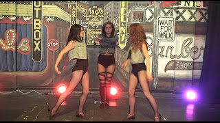
I like this image however it would not look right on a cd/ It is not framed right.
I love this as it works with the edgy and jumpy alternative beats of the song I think it will look great with text on the front or back of the cd case since my artist is dominant which is fitting with conventions.
This image would have been great however it is a bit too blurry near the jacket, and would therefore not look professional.
both of these images above and below are fitting with the conventions of a digipak. However I think her expressions are too casual
This again is too blurry but could be fitting with the snap shots of dance often found within digipack leaflets.
This is great framing but far too blurry
Again this rule of 3 framing is great yet the dancers are out of time
again too blurry and kat's hand is covering her face
This image could also look great on the front of back of a digipak as my artist is dominant. I love the quirky lighting and spikes.
Too casual
I love this image as it shows my artist soaring and all the attention is on her
I also love these images as they have audience interaction features, likewise to the other image with Meg on the chair they both could also look great on the front of back of a digipak as my artist is dominant. I love the quirky lighting and spikes being central...


No comments:
Post a Comment