Thursday 28 February 2013

Magazine promo advert drafts 1, 2, 3 and 4

 
DRAFT 1
 

DRAFT 2
 
 DRAFT 3
 
 
 DRAFT 4

digipak draft 2 analysis

I have  defined with a circle the areas where two cds will go and to highlight how the background works

Furthermore I  moved the image of the background to the middle of the two cds since it breaks up the images all being of my artist.

I added clear and prominent song titles to the back of my cd to follow the conventions. I highlighted this by using the same font style as the reviews with the stroke to outline it.

I also added the record label I created to the back and inside cover of the digipak to convey that it was from a record company.

Meg's legs have been stretched too much to make them look very wide on one of the photos.

digipak draft 2


record label drafting 1, 2, and 3 and thought process

DRAFTING AND THOUGHT PROCESS
 
 
This did not look as effective as I hope although I did like the compact shape.

This draft was difficult as I tried to make the flowers more prominent but I thought it looked childish and unporofessional which is completely the opposite of my aims.

 
Therefore, I decided to use a single flower. I change it to greyscale to fit with my image and follow a succint colour scheme. Once I had decided this is the style I liked I started considering text.

 
I wanted to use a white text to fit in with the house style however I noticed it was barely visable and looked silly above the image.

 
Upon seeing this I moved the text onto the snake, manupulated it with the stroke tool to allow it to be seen. I also used the arc tool to allow it to pop out the page and wrap around with the snake. I also used the eraser tool to reveal the once covered up snake teeth to allow my image to be effective.
 
After cropping the image down I was very happy with my finished product.

Wednesday 27 February 2013

List of things to add to my blog:

make sure all 3 music video analysis are actually posted YES

write up about my research regarding digipaks and promo adverts YES

record label details YES

record label codes and conventions with examples YES

write drafting process of digipak and final digipak YES

production plans YES

write about latest disaster in editing suite YES

other drafts of advert

final record label analysis

I chose this record label out of my drafts since I think it was the most effective. I wrapped the text around the snake and embossed it with the stroke tool. I also used the same font as I used in the digipak for OREA ELENI to allow continuity.

 The snake here, looks powerful and vicious which is what I wanted it to be like regarding the quote I found. Also, the flower looks magical and deceptive which again is fitting with the quote. The two images contrast but have been manipulated togoether to juxtapose and attract the eye.

I craftily used the eraser and rotation tools to rescale and move the flower appropriately . I also used the transfrom scale tool and arc tool to allow the font to become 3d and slightly pop out of the page.

final record label


my record label ideas

I decided upon the name Serpent Flower Record

Look like the innocent flower, but be the serpent under't (1.5.74-5)

Some editors believe these lines derive from Virgil's Eclogues 3.93,
You, picking flowers and strawberries that grow
So near the ground, fly hence, boys, get you gone!
There's a cold adder lurking in the grass.
 
For me, it is a memorable quotation from Shakespeare's Macbeth and portrays themes of evil lurking under the innocence. A strange and intriguing idea.

For it I have thought of an idea of entwining a serpent  amongst some flowers in black and white with the name accross it.

codes and conventions of a record label

I noticed that most of these record labels are in black and white, therefore I have decided to follow this code. Also on some record labels such as ACACIA and others the text is formed to arc around and fit in with the coresponding image and wrap around it. I will also employ this feature and create an image to go along side it.


Tuesday 19 February 2013

pictures to create record label and thought process


I researched existing and clipart images that were free to manipulate on the interent for ideas for my record label... the record label is called serpent flowers which I decided upon via a questionnaire aimed at my target audience

   
I particularly liked this image as it is plain and simple, it is not too overwhelming and will not dominate my products yet it will be noticed

This image is fitting for what I was originally looking for, a flower to entwine with a snake. However I have decided I would like the snake to be more visible than the flower.

This image is impacting yet too plain for what I wanted


Again this is plain and simple, it is not too overwhelming and will not dominate my products yet it will be noticed. However I think it was important to add a stalk to the flower after attempting to make it look realistic with the snake.


This image caught my attention as I thought it was great how it was tangled and took up a small area. However many people made a rather comical point that it reminded them of a pretzel, therefore I couldn't use it!


This image was different to what I was looking for. I liked the idea of the ancient woman toying with both snake and flower. However I wanted to create my own image therefore this could only be admired and not used.


After thinking about how to use the snake and flower images together I decided to look at tattoos for inspiration, I realised that I need to look at more complex snakes to get the effect I wanted.

This image of a rattle snake poised for attack caught my eye. However the space around it proved to be too empty to do what I wanted.


This image is what I was looking for a snake coiled up (but not like a pretzel) and also poised for attack with attitude that fits with my quote


Another example of a tattoo


This image is effective but again has too much empty space and isn't facing the right way.

I loved this tattoo stencil however it was too complex to recreate


Another example of a tattoo

I love this image of a flower, however the record label is in black and white so if I use it I will have to manipulate the image.

Friday 8 February 2013

Music video draft 4

Chorus not fully edited also out of focus ring is not meant to be present in the first few scenes random error:


Digipak draft 1


I like the idea and house style of my cd being fitting with the chorus as this is the only continuous mise-en-scene that does not change throughout the video.

I have decided the areas where the two cds will go need to be defined with a circle to show how the background works

Furthermore I have decided to move the image of the background to the middle of the two cds since it breaks up the images all being of my artist.

Also this work is unfinished as it needs to have song titles added to the back as well as the record label etc

Magazine promo advert DRAFT 1 AND REALISATIONS

WHAT I CHANGED TO CREATE MY FIRST DRAFT

  • I changed the TEMPTED to red to fit with the house style and not be so obscure
  • I also changed the font from BE TEMPTED 7TH MARCH to fit with the reviews so it was no so chaotic
  • I also further embossed and gave a 3D effect to Orea Eleni to allow it to pop out at the audience literally.


REALISATION
  • I have decided that the BE TEMPTED 7TH MARCH tagline is too long and not fitting.
  • I may switch round the title to the bottom and reviews to the top
  • Also the HMV logo is actually not relevant, since the media is becoming digitalised.
  •  I need to add a website
  • I may consider taking more pictures to produce more drafts although I do like the look of this advert more than before.
  • I do not know whether to experiment with a more close up picture of Meg or keep her with the dancers.


Thursday 7 February 2013

Photos for digipak

I like this image however it would not look right on a cd/ It is not framed right.

I love this as it works with the edgy and jumpy alternative beats of the song I think it will look great with text on the front or back of the cd case since my artist is dominant which is fitting with conventions.

This image would have been great however it is a bit too blurry near the jacket, and would therefore not look professional.


both of these images above and below are fitting with the conventions of a digipak. However I think her expressions are too casual


This again is too blurry but could be fitting with the snap shots of dance often found within digipack leaflets.

This is great framing but far too blurry

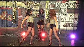
Again this rule of 3 framing is great yet the dancers are out of time

again too blurry and kat's hand is covering her face

This image could also look great on the front of back of a digipak as my artist is dominant. I love the quirky lighting and spikes.

Too casual

I love this image as it shows my artist soaring and all the attention is on her


I also love these images as they have audience interaction features, likewise to the other image  with Meg on the chair they both could also look great on the front of back of a digipak as my artist is dominant. I love the quirky lighting and spikes being central...